Not sure how significant that is but it put me on the front page of the website and made me feel good!
Lara - watercolor on paper.
Lara - watercolor on paper.
Not sure how significant that is but it put me on the front page of the website and made me feel good!
Around Christmas, we went to see my family in Sacramento (and that's where I got my watercolor Moleskine! :)). I drove 450 miles to and from, with a 4.5 month old baby and a dog. I feel like a hero.

Crayons, found in various places in my brothers' room, turned out to be quite interesting. You can add color to your lines plus they resist paint so bravely!

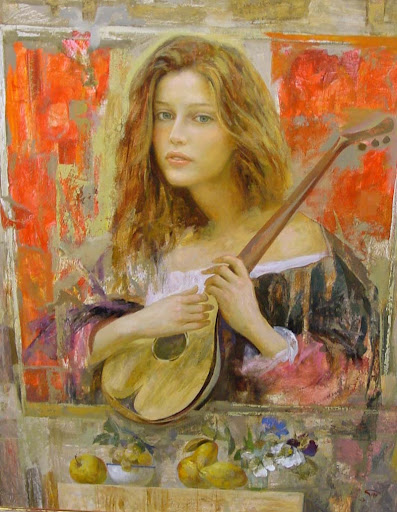
Amazing painter. Okay, it's "good old" young pretty girls, but somehow it's more than just girls. They seem enchanted and mysterious, and the colors...beautiful.
There is a little mountain around here that I keep looking at and keep being amazed at how quickly the shadows and the colors of it change throughout the day. In real life, it is a regular brown piece of earth and stone. Once in a while, though, it takes on a fantastic orange color with deep purple shadows. Now, my landscapes are not...very good. I just get lost in all the subtle variations of light and shade and get frustrated when the painting doesn't communicate the awe I feel when I look at nature. But sometimes I fall into the trap of trying landscapes again and again. We are currently staying at our friend's house, which has a nice second-floor balcony with an unobstructed view at the above mentioned mountain. A perfect spot for painting (until about 3 pm when it starts getting cold). So I did it. I tried painting the orange mountain, even though it's not particularly orange today.

Obviously, this is a good example of how much I suck at landscapes. I got excited about the colors, jumped into it without waiting for the paint to dry, and messed up the values. So much for that.
So...I decided to slow down and do a study. Of course, you usually do a study before the big painting but this time I was just so excited about the colors I plunged right into it. Anyway, here is the study, done slowly and methodically:

The color is much more subdued but the layered washes look cleaner, in my opinion. It captures the form and nature of the mountain much more accurately. First one still seems to be a better expression of the idea of this mountain that I had in my head, where the orange color dominates and the shadows are incredibly blue but I like the second, slower study more.
Bonus: another mountain that i sketched sometime last month:

My husband has a beautiful voice and a thousand times more music ability than me. He also plays guitar. Last week, he played and sang some songs via video chat for a friend of his and I used this opportunity to sketch him. Here are the results. I think the sketches get progressively better. I added color on the two last ones because they were just asking for it :)
Painting of my son I did for my mother-in-law's Christmas present
Thought I'd fill you in on where my blog title comes from: it comes from a poem by Gregory Corso: I Miss My Dear Cats
My water-colored hands are catless now
seated here alone in the dark
my window-shaped head is bowed with sad draperies
I am catless near death almost
behind me my last cat hanging on the wall
dead of my hand drink bloated
And on all my other walls from attic to cellar
my sad life of cats hangs
My life is not generally sad and I don't have any cats (anymore), but I just like the phrase "water-colored hands". Fits my purpose, too :)
American artists seem to favor flat bristle brushes for watercolor, a preference which I've never quite understood. I am a fan of fat round brushes that can hold a lot of water. This artist is using a round brush and I think it's working great...
This is an early morning sketch (not that I like sketching early in the morning, it's just that my baby likes to wake up and shine early...). Somebody could invest in waterproof pens, eh?
I got a Moleskine watercolor sketchbook for Christmas and now I'm back to regular sketching ( I hope :). This is from today: Tried toning the paper before drawing on it and I do like the result! I think it could work on a larger scale, too. Back to Christmas and sketching: my present for my younger brother was the "Illustrated Life" by Danny Gregory. I think I was more excited about this book than he was! It is very interesting to both read and look at the pages of someone else's sketchbook. Do check it out.
P.S. The quote at the top is from Lori McNee's fine art tips