


Watercolor on Yupo, the synthetic paper
Yupo is an interesting painting surface. I finally tried a couple of things on it with watercolor and I feel like I'm only beginning to understand the way it works. It is definitely different from the traditional cotton cold press watercolor paper. Pros I've discovered so far:
- paint stays bright and saturated (of course, you probably use less water than with cotton cold press)
- the way that the paint mixes on paper creates interesting effects (do see the full size pictures!)
- paint stays wet for much longer than on cotton cold press (or hot press). I guess this could be a disadvantage, too, but it does give you more time to play.
- Yupo does not buckle
Cons:
- Yupo is extremely sensitive to any at all grease. While this can be used to create nice effects in the painting, I was a little disappointed to see my own fingerprints all over the paintings. You do need to be tidy when working on Yupo.
- layering of paint, while still an option, doesn't work quite like it would on cotton paper. The underlying layer tends to smudge and mix with the new one. In the painting of poppies, I wish I didn't do the second layer.
Other observations, which I wasn't sure if they were good or bad yet:
- It's harder to control the paint on Yupo than it is on cotton paper. I am suspecting, though, that it is a matter of practice and habit. A lot of people claim that watercolor is difficult in general, and we know it's not true ;)
- It is relatively easy to scratch the paint away from the surface of the paper. I used this effect in the painting, but I also found myself a little worried later that the painting would get scratched just from handling.
Missed Connections

In case you haven't seen it yet, here's the link to Sophie Blackall's Missed Connections. They are: adorable, quirky, funny, ironic, sad, and beautiful. She says,
"Messages in bottles, smoke signals, letters written in the sand; the modern equivalents are the funny, sad, beautiful, hopeful, hopeless, poetic posts on Missed Connections websites. Every day hundreds of strangers reach out to other strangers on the strength of a glance, a smile or a blue hat. Their messages have the lifespan of a butterfly. I'm trying to pin a few of them down."
Untitled I ;)
After a week of crashed laptops and lightning-stricken internet towers, I am back!
The two portraits I've been working on are progressing, albeit slowly.
I also painted a couple of little paintings (to be scanned) and worked out the composition for the group portrait.

And some time last weekend, I had Christmas again: my order of artist supplies came in from Blick. A huge 18x24 Arches block (I'm trying to think bigger!), a couple sheets of Yupo to finally try, a big fat ultramarine tube (because I'm always out of my blues), a Lama Li watercolor sketchbook (niiiiice handmade texture though the sheets feel a bit thin) and a set of Shiva Artist's Paintstik Oil Colors. I am artistically drooling all over everything :) Now I just need a little me-time to convert my excitement into some art! :)
Yay! A new commission!
I heard (read) a lot of good things about Etsy.com. I bought beads from there (when I was into making jewelry) and recently, BumJoy cloth diapers. A couple of weeks ago I decided to try out Alchemy, the piece of Etsy where you can request custom items to be made by the crafty maidens and the crafty maidens bid on them. Kind of like the design-bid-build method of project delivery. Oh wait, I guess it's more like design-build...Anyway, I bid on a couple of requests for custom paintings and I won one! It is a group portrait of three little girls. I promise to post the progress reports! :)
Sketchbook update
in sketchbook
Here's what I sketched last week: My keys with a house key missing because a) we don't have a house yet (it will hopefully close in a couple of weeks) and b) because the house we currently live in has an electronic lock. Also, there's my expired AIA card, declaring my undying love for architecture in spite of everything. Oh, the idea to draw keys came from a "scavenger hunt" list of things to draw on Wetcanvas.com (In the Life Drawing section). They have a new one every 9 days.
Elijah drifting off to sleep at my breast :)
This was sketched from an black-and-white photograph of my home town of Khmelnitsky, Ukraine. The color is absolutely arbitrary.
This one is "Three Elijahs chewing their thumbs." I was trying to sketch him and he kept moving, so I tried again and again...
Rebecca Elfast, watercolorist
I am in love. Her paintings are incredibly simple and yet sufficiently sophisticated. She dares to use a lot of dark values in watercolor. Her colors are beautiful... http://www.rebeccaelfast.com/0engindex.html
About some books
in reviews
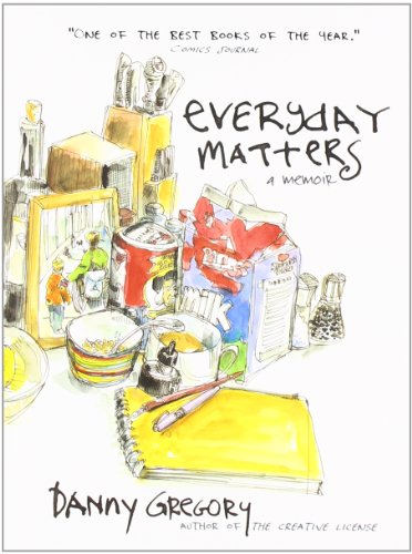
One of the books I'm reading now is Danny Gregory's "Everyday Matters." I've always liked books where pictures take up more space than words. It is great, and my only regret is that it is so short. One quote that I wanted to share is about the process of drawing: The reason why most people draw badly is because they draw symbols instead of what they see. A nose is a sort of triangle. An eye is a circle with another one inside. An ear is a circle with a squiggle. The brain has an inventory of shorthand symbols for stuff and that's what we draw.
It's very human. Assigning things to categories, using symbols and signs; these skills separate us from the beasts. Unfortunately, these symbols are a screen through which we come to see the world. We say, "That person is rich, that one's crass. He's a criminal type, she's a blonde, they're famous, she's in a wheelchair..." We lump people and things and experiences into categories and deal with them accordingly. It's efficient but it strips the world of texture and chance, like eating every meal at McDonald's or wearing the same uniform every day.
This kind of thinking shows itself when we try to draw. In fact, that's the reason most people will say, "Oh, I can't draw." Kids never say that, until they reach the age of twelve or so, and their symbols are hard-baked.
I think this is very true and it's also true when it comes to painting and seeing color. A yellow lemon is not always yellow, and white is not the absence of color but pretty much any color you like...I love looking at colors around me. I get excited about colors and my husband shakes his head and calls me a dork. I savor the warm reds and oranges and deep blues, I decipher the grays into yellows and purples and greens. Colors make me happy :)
On a different note, another book I'm reading is "The 12 Secrets of Highly Creative Women" by Gail McMeekin." It has glowing reviews on Amazon but so far, I'm finding it quite disappointing. The best thing about it is the quotes on the margins. It could be useful to somebody who is stressed, depressed and lost in their life and has no creative outlet. I was looking for practical advice and this book is more like a counselor. Get in touch with your intuition, spend time with yourself, and fuel your creative energy. All good stuff but nothing new.
Girl with grape-vine, and another child portrait
Good morning...I think I would pay somebody to let me sleep in on a Sunday morning. I worked on two portraits yesterday, one commission and the other a painting of my husband's little niece. I saw a photo of her wearing a bright multicolored scarf and I just had to make a painting! :) Here are pictures at the beginning and at the end of the day. You can definitely tell which one I worked on more:
And the little girl:
Both of the subjects are back-lit (contre-jour!), and in the case of the girl with grape-vine, there is also flash from the camera, all of which makes working on it a little confusing. I find myself inventing the shadows and lights on her face, and it feels like her whole face should be much darker.
Girl with grape-vine, progress report :)
Yesterday, I made the drawing for it (I don't always draw before painting but I felt that this was a little too complex to skip the drawing):
I wet the paper to wash away the extra graphite and grease, and since the paper was wet, went ahead and put some color on:
Once it dried, I did another wash:
And after this one was dry, another one:
And that's kind of where I am tonight (one wash ahead, but I'm waiting for it to dry). Started another portrait, too! Pictures tomorrow.
Oh, and by the way, this is the tiny little space I have to work in while we're waiting on our house to close...:
Starting on a new commission!
And planning to document it from beginning to end. I kept putting if off because there is work to do before starting the act of painting but now I feel ready :) I will be working from photographs:


So, I played with different variations of the composition. I picked the first photo as the main reference and cropped it this way and that while sketching ideas of the composition. I moved the grape-vine to cover more of the face, to give it a little more playfulness.


I was still not quite sure about the composition so I decided to make a full size sketch and see how that looks:
I like the diagonal movement of the grape leaves and the overall V-shape that the direction the girl is leaning in and the grape-vine are forming. I also decided to give a little more space in the upper left area. I can always crop it if I don't like it in the end.
Of course, there are precedents of a "girl with grapes" in art history. The one I've known since art school is by Karl Brullov:

"Italian Midday" 1827. Back in the day when being plump was good.

Lara - watercolor on paper.
I was featured on RedBubble.com
Not sure how significant that is but it put me on the front page of the website and made me feel good!
A couple of sketches from Sacramento
in sketchbook
Around Christmas, we went to see my family in Sacramento (and that's where I got my watercolor Moleskine! :)). I drove 450 miles to and from, with a 4.5 month old baby and a dog. I feel like a hero.

Crayons, found in various places in my brothers' room, turned out to be quite interesting. You can add color to your lines plus they resist paint so bravely!
I found Goyo Dominguez

Amazing painter. Okay, it's "good old" young pretty girls, but somehow it's more than just girls. They seem enchanted and mysterious, and the colors...beautiful.
How to fail gracefully
in sketchbook
There is a little mountain around here that I keep looking at and keep being amazed at how quickly the shadows and the colors of it change throughout the day. In real life, it is a regular brown piece of earth and stone. Once in a while, though, it takes on a fantastic orange color with deep purple shadows. Now, my landscapes are not...very good. I just get lost in all the subtle variations of light and shade and get frustrated when the painting doesn't communicate the awe I feel when I look at nature. But sometimes I fall into the trap of trying landscapes again and again. We are currently staying at our friend's house, which has a nice second-floor balcony with an unobstructed view at the above mentioned mountain. A perfect spot for painting (until about 3 pm when it starts getting cold). So I did it. I tried painting the orange mountain, even though it's not particularly orange today.

Obviously, this is a good example of how much I suck at landscapes. I got excited about the colors, jumped into it without waiting for the paint to dry, and messed up the values. So much for that.
So...I decided to slow down and do a study. Of course, you usually do a study before the big painting but this time I was just so excited about the colors I plunged right into it. Anyway, here is the study, done slowly and methodically:

The color is much more subdued but the layered washes look cleaner, in my opinion. It captures the form and nature of the mountain much more accurately. First one still seems to be a better expression of the idea of this mountain that I had in my head, where the orange color dominates and the shadows are incredibly blue but I like the second, slower study more.
Bonus: another mountain that i sketched sometime last month:

An evening of music illustrated
in sketchbook
My husband has a beautiful voice and a thousand times more music ability than me. He also plays guitar. Last week, he played and sang some songs via video chat for a friend of his and I used this opportunity to sketch him. Here are the results. I think the sketches get progressively better. I added color on the two last ones because they were just asking for it :)
Elijah
in commissions
Painting of my son I did for my mother-in-law's Christmas present
elijah in hood
about the watercolored hands
Thought I'd fill you in on where my blog title comes from: it comes from a poem by Gregory Corso: I Miss My Dear Cats
My water-colored hands are catless now
seated here alone in the dark
my window-shaped head is bowed with sad draperies
I am catless near death almost
behind me my last cat hanging on the wall
dead of my hand drink bloated
And on all my other walls from attic to cellar
my sad life of cats hangs
My life is not generally sad and I don't have any cats (anymore), but I just like the phrase "water-colored hands". Fits my purpose, too :)
Watercolor demo by Ng Woon Lam
American artists seem to favor flat bristle brushes for watercolor, a preference which I've never quite understood. I am a fan of fat round brushes that can hold a lot of water. This artist is using a round brush and I think it's working great...
early morning view from the window
in sketchbook
This is an early morning sketch (not that I like sketching early in the morning, it's just that my baby likes to wake up and shine early...). Somebody could invest in waterproof pens, eh?