Day 8 - Under the Fig Tree Plein Air Watercolor Painting

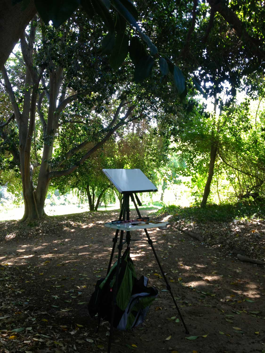
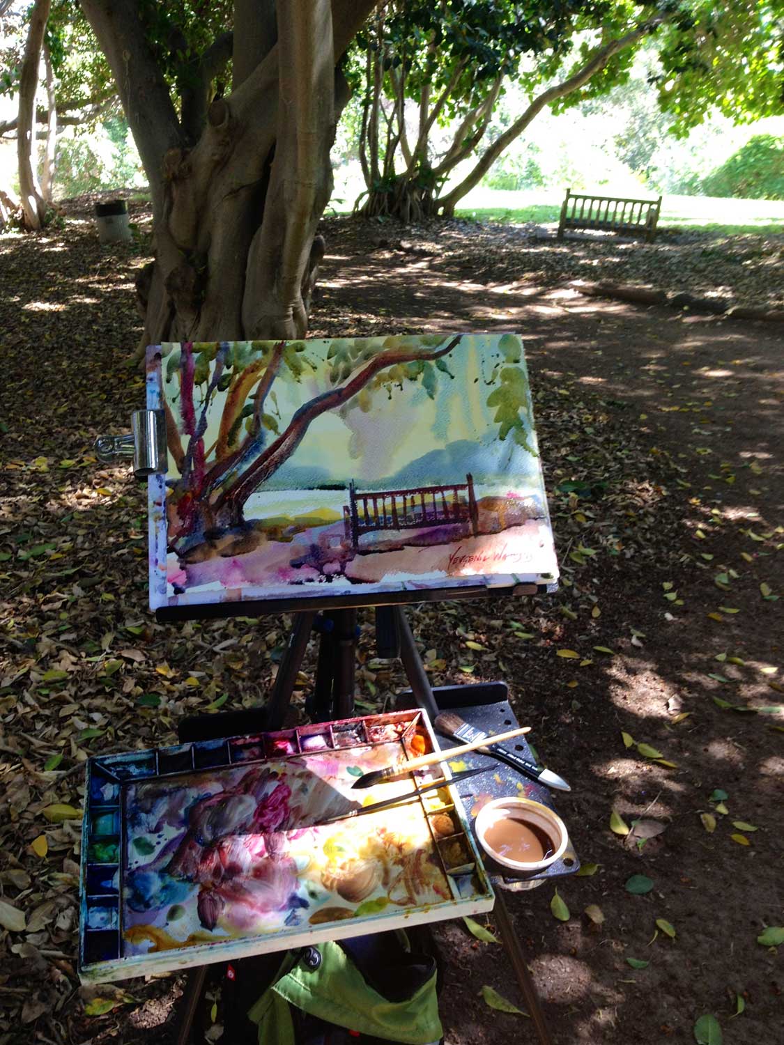
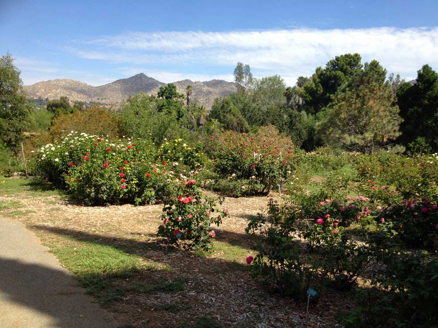
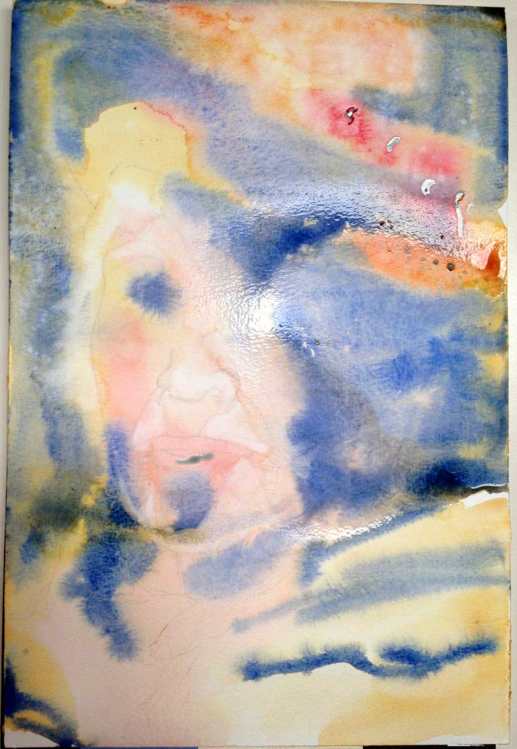
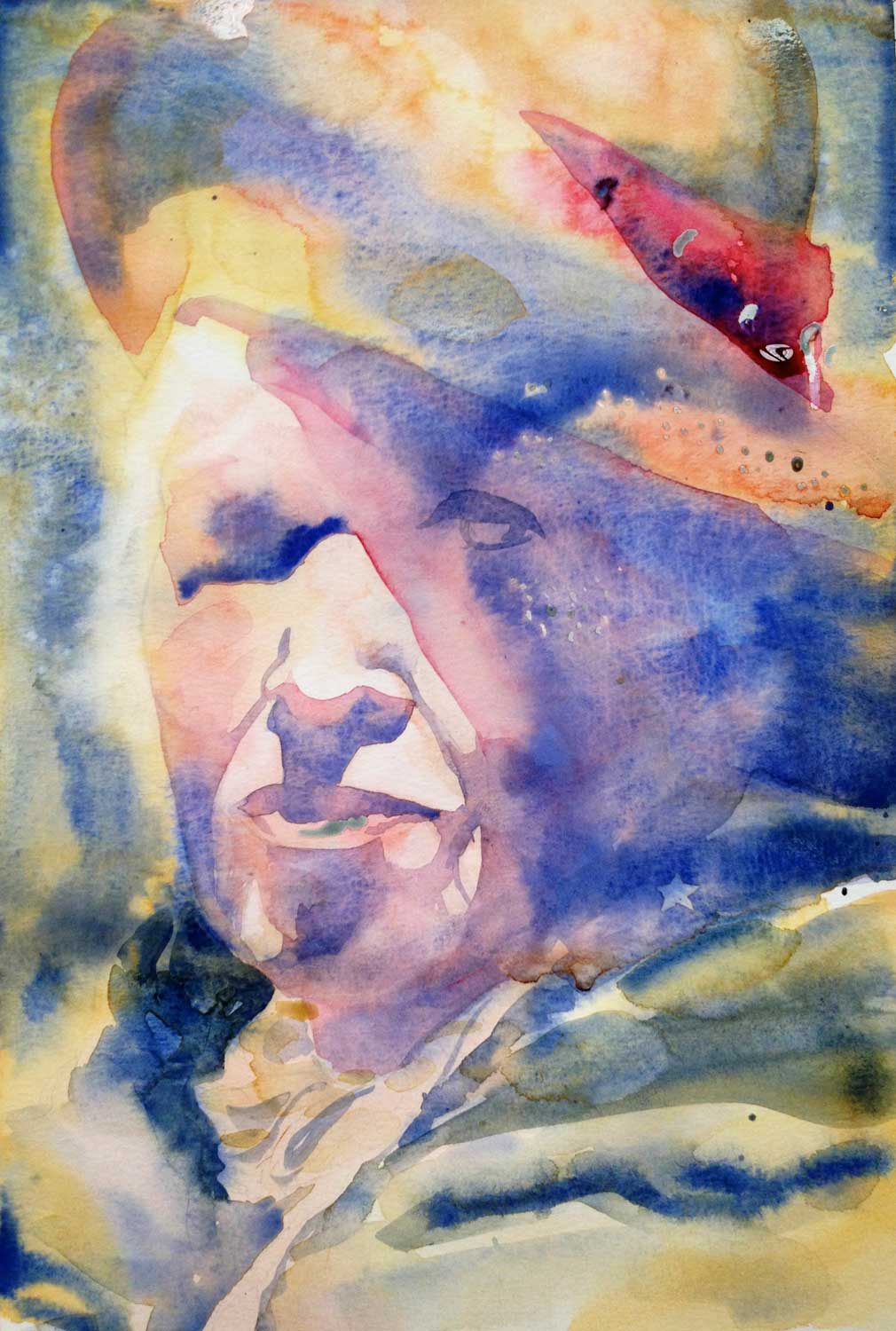
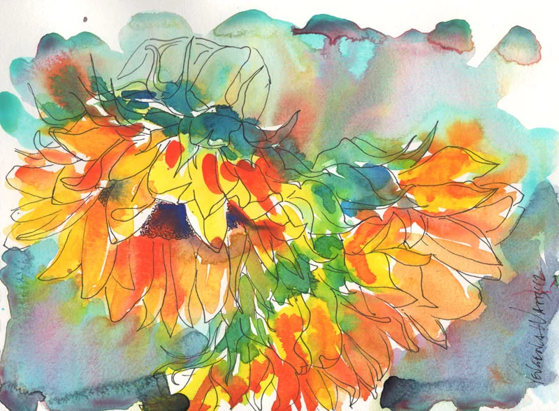
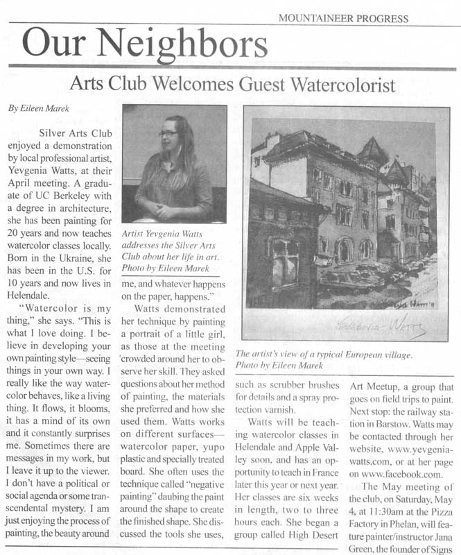
I went to the University of California Riverside Botanic Gardens to get some plein air time this morning. It's a bit of a drive for me (everything is a drive when you live in the middle of nowhere...) and it was hot. I was exhausted after just three hours. But I do like painting from life (as opposed to painting from photos) and most of the time, it's worth the drive and the discomfort. I had another artist with me, Barbara Parish, and we had a good time chatting and learning about each other. Barbara and I met through my High Desert Art Meetup group.

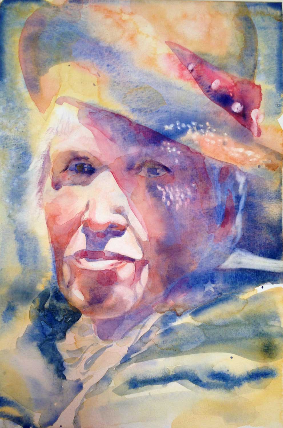
"Under the Fig Tree" - 11 x 15" Watercolor on paper. $95. Buy here. 

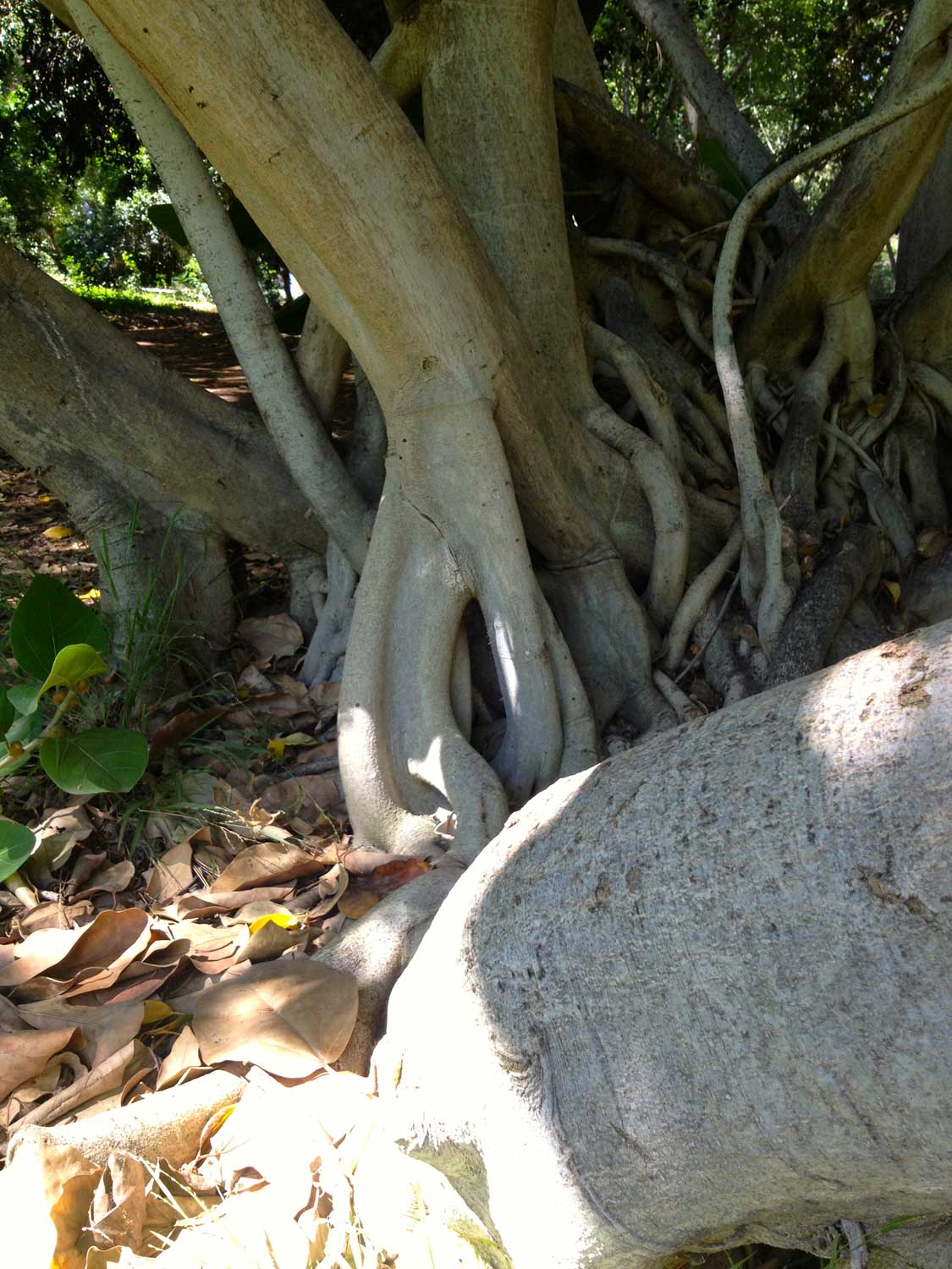
I spent the first hour figuring the place out and walking the trails (which get pretty steep, by the way!) And looking for a nice shaded place with a view. This area with large leafy trees fit the bill, so I set up my easel and got to work. The painting above was the second one I did at that location. I will post the first one tomorrow.
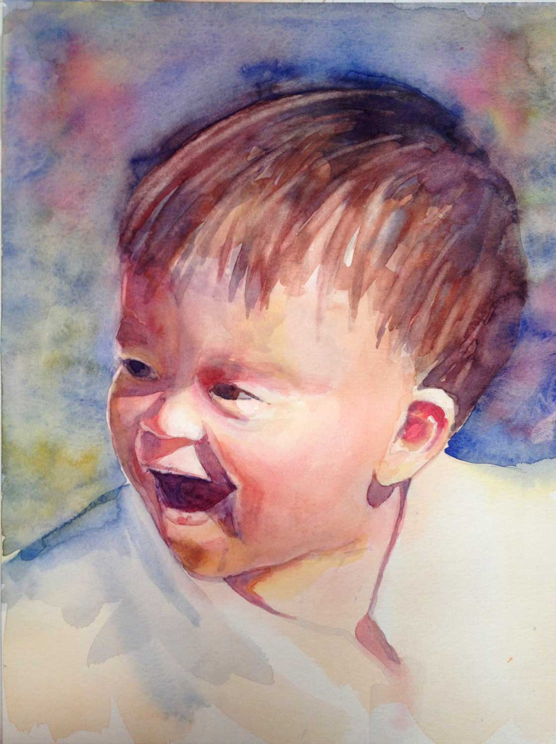
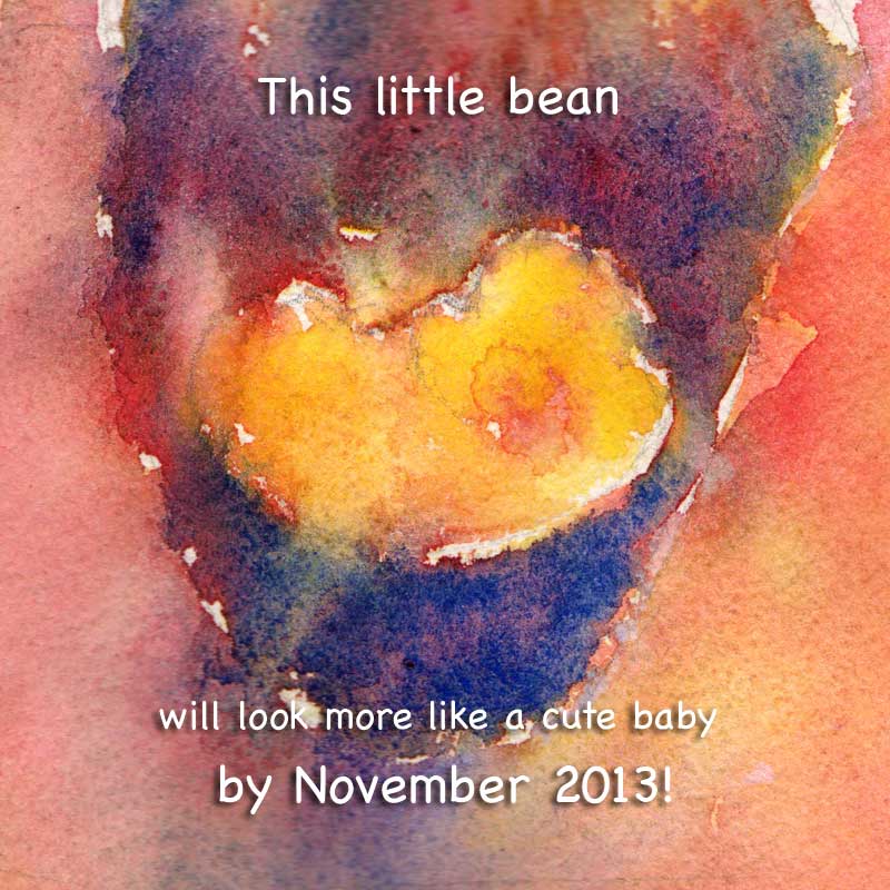
Day 7 - more Yupo!

Another busy day today. I had my last class of an Intro to Watercolor course, which was a little bit sad. This has been one of my favorite groups of students so far: interested, committed, talented, and hard-working. An excellent combination for any new thing to learn, but watercolor especially. I loved working with them and hope to see them back for more in the future :)

6x6" Watercolor and Nupastel on Yupo. 

My daily painting today is actually a little demo I did in class, just showing different stuff you can do with Yupo. It's not a finished painting but I like it so far and I may work on it some more (at some obscure later date...hmm...let's not go into details here).  

Tomorrow, I plan on driving to the UC Riverside Botanic Gardens for a paintout. So it should be a good productive morning, or at least an interesting one.  

Day 6 - A sketch of some bird of paradise trees

I had a doctor's appointment this morning. No big deal, just a routine 7-month pregnancy checkup (yep, in case you didn't know...I'm pregnant). Well, I ended up spending most of the day at the hospital! I've been having some issues including an episode of what looked suspiciously like preterm labor, so they wanted to run a couple of tests and an ultrasound to make sure nothing funny is happening. I'm all good, just need to slow down and get plenty of rest...Easier said than done.

Marker on kraft paper. 

Anyway, I didn't get to paint today yet (I may still, after the kids go to bed), but I did bring my sketchbook with me and doodled a little. The Kaiser hospital I went to has a really nice area between the buildings, with water features and lots of plants. While I was waiting on one thing or another, I sketched this group of bird of paradise trees . They also inspired all kinds of abstract ideas, so I intend to revisit these shapes soon :).

Day 5 - A Silver Lakes Sunset

We've had some amazing clouds here lately, which are a total distraction to me when I'm driving. Dangerous stuff!  

10.5 x 13.5" Watercolor on paper. $95. Buy here. 

I painted this one from a photo that I took yesterday, just up the road from my house where the road ends and the creosote bush begins. This is attempt #2. The first one didn't turn out well at all and is now resting in my recycling bin. Oh well. Something that I learned from my initiation into pottery this summer is that when a ball of clay is refusing to center itself on the wheel, you just keep pushing. When a bowl turns into a "catawompus", you scrape it off and begin a new one.

Day 3 - Palomar watercolor on Yupo

Today, I focused on abstract shapes in a landscape. I worked from a photo that I took on a camping weekend at the Palomar Mountain (near San Diego). I made a few sketches and a not-so-successful watercolor painting before arriving at this piece.

Palomar. 10x10" watercolor and Nupastel on Yupo. Currently not for sale. 

I used a bit of Nupastel in addition to watercolor. You can see the squarish marks from where I dragged the piece of pastel on its side, in the tree foliage and the path. I will probably rework this again. One of the wonderful things about Yupo is that it allows you to wipe off (or just wash off under the faucet) most, if not all, of the watercolor.

What's on My Palette?

So glad you asked :)! My watercolor palette is a perpetual work-in-progress and I think it will be fun reviewing it once in a while. As of today, this is what it looks like:

It's a John Pike's palette and I'm quite happy with the number of wells, their size, and the ample mixing area. I rarely use the lid for mixing.  

Click on the image to view John Pike's palette on Amazon.com

Okay, the interesting part. Colors, from left to right: 

(Colors in bold larger font are ones I use most. The links are affiliate links and will take you to DickBlick.com. If you buy something, I will get a small percentage for sending you their way. Thanks in advance!) 

Blick Dioxazine Violet.


I put it in there more out of habit than out of need. I pretty much never touch it anymore, but dixazine purple used to always come with my St Petersburg pan watercolors, so I've used it for years.

Winsor & Newton Cobalt Blue.

I use it when I want a slightly lighter and more opaque version ofFrench Ultramarine.  

Winsor & Newton French Ultramarine.

The paint I should probably buy by the bucket. In the absence of buckets, I get the largest tube available (37 ml). And it gets used all the time.  

Utrecht Cobalt Turquoise.

One of those random colors I have and occasionally use. Makes a very delicate violet color when mixed with Quinacridone Red.

Blick Phthalo Blue.

I have a complicated relationship with this one. I love it for giving me nice, transparent darks and brilliant greens, but I hate it for not drying fast enough on the palette and invading every single color while I'm on the move and the palette is not just sitting on a flat surface. It's also a bit of a pain to clean up and it's a staining color (so, don't put it where you think you might need to lift paint later). I am considering either keeping it in a separate container or just bringing a tube when I need it.

Holbein Verditer Blue.

Used occasionally. A semi-opaque, easy-on-the-eye color. Thanks to Tom Schaller for introducing me to this one.  The well next to it holds the remains of American Journey Manganese Blue, which turned out to be kind of dull and very crumbly. Not at all the same thing as Winsor & Newton Manganese Blue.

Daniel Smith Blue Apatite Genuine.

Another random color I use very rarely. Super-granulating, bluish dark gray. I like it, I just don't often paint something that would call for it.


Same goes for

Daniel Smith Indanthrone Blue.

Beautiful, transparent dark blue. Reminds me of writing ink.

Daniel Smith Quinacridone Red .

This is my primary red color. I can warm it up with a yellow or cool it down with a blue. It mixes well with pretty much anything. I tried this color in other brands and it works just as well. Quinacridone Magenta used to be in the well next to this one, but I found it to be a bit redundant. The other well next to it used to hold Daniel Smith Rhodonite Genuine. A pretty color, but it crumbles like crazy when it dries on the palette and I can't say it's essential. I also read somewhere in forums that Rhodonite shifts in color.

Daniel Smith Quinacridone Sienna.

Love it! Apparently, I also need a new tube of it. Again. The color is a nice rusty orange. Transparent, mixes well with most colors on my palette. Not to be confused with DS Quinacridone Burnt Orange, which is actually a rather boring brown.

Maimeri Blu Cadmium Orange.

A basic orange color, semi-opaque. Not used very frequently but is good to have when I need an intense orange. The well next to it is the above-mentioned Daniel Smith Quinacridone Burnt Orange - which is not an orange at all, and I will be scraping it out and throwing it away.

Next one is my primary yellow well.

Currently it's Daniel Smith New Gamboge  but I'm pretty sure there is some Daniel Smith Hansa Yellow on the bottom. Maybe even some Indian Yellow. I'm not very picky there. The blob in the next well is

Maimeri Blu Raw Sienna.

A bit too brown and boring for my taste, so I will be scraping that one out, too. 

Blick Yellow Ochre. 

A good color to have, but not a necessity. Quite opaque and tends to get chalky.

Winsor & Newton Quinacridone Gold.

Another color I buy a lot of. Wonderfully transparent, somewhat greenish yellow. I tried it in other brands, trying to find the same thing but cheaper, and was less than impressed. Winsor & Newton it is.

That's it! I also own a box of St Petersburg (Yarka, White Nights) pan watercolors, with some pans already emptied and refilled with other stuff, for trips and such, when I would not bring my large palette.  

What about you? What are the staples on your palette? 

P.S. For an excellent concise overview of different watercolor brand paints, check out this Wonderstreet article.

Plein Air Paint Outs

Plein air, in case you aren't in the secret circle of those who know, is a fancy (French) way of saying "outdoors" - as it relates to painting. In the last five months (right before I found out I was pregnant - though I haven't made the connection until now) I've been a lot more proactive about getting out of the house and going somewhere to make art. I started a Facebook group and, recently, a Meetup.org group to involve other local artists. It also led to an ongoing series of figure drawing sessions at the Burning House Art Studio in Apple Valley - but that's another topic worth a few more blog posts :).

While I am not new to plein air painting, it has been a long time since I pursued it with any intensity. Even now, doing it a couple of times a month is not really that intense - but I am enjoying it a lot and want to do more. I'm hoping it's possible with three little kids...we'll see. The projected arrival of kid #3 in early November has given me the momentum to start the groups and organize events. Probably because I know it will be tough to do anything for quite a while after the baby is born. So...the plan is to have fun and wear myself out so that I'm sick of art and am ready for a break from it. Or something along those lines :)

I wrote about our first, Oro Grande Sketch-out before. After that, we went to the Buddhist temple in Adelanto. The place is in the middle of nowhere (as is anything here, I suppose...this IS the middle of nowhere ;)) and it surprised me with beautiful architecture, a sculpture garden and what seemed like hundreds of birds (see video below and listen...it's beautiful).

At the same sketch-out, I met Kate of Katesfolkart , a wonderful local artists who paints scenes from the middle-of-nowhere I mentioned above and makes it look good :) She is now one of my most consistent sketch-out buddies.

I'll try to write a bit about every sketch-out we've had so far, so keep an eye out for more reports :). For now, some of my sketches from the Buddhist temple outing: 

My Portrait Painting Workshop is this weekend!

I can't believe it, but yes! This weekend, August 3 and 4, I am teaching my first Portrait Painting Workshop! My past students probably remember me talking about wanting to do a workshop like this forever, and now it's happening! :)  Thank you to Joan Sowinski for hosting it in her Burning House Art Studio and to those who already signed up. A couple of people had to cancel this time, so I have a few spots still available.

I have lots of material...more than I can squeeze into two days, but I will try my best to give as much as I can. I am hoping we will even have some time to work with a live model!

How to Make Greeting Cards with Your Art

You have many great options when it comes to making cards with your artwork on them. The easiest one is outsourcing the whole process through a print-on-demand website (FineArtAmerica.com, Society6.com, RedBubble.com, Imagekind.com, etc). If you want a larger run of the same image, a printer like VistaPrint is probably your best bet. All of these services will give you a good quality, albeit generic-looking card. Now, what if you want to be a little more personal? I, for example, love having my signature on my cards. It's like a stamp of approval. It's me holding it in my hands, liking what I see, and saying so to my collector (because yes, even those who buy a card from me become my collectors :)). So this is how I do it:

handmade fine art card

1. The print

Let's assume you already have a nice, high-resolution, color-corrected digital image of your artwork. I scan most of mine, photograph those that can't be scanned and then adjust the color using Photoshop.

I use the same printer (Epson Stylus Pro 3880 Color Inkjet Printer) and paper (Epson Ultra Premium Presentation Paper MATTE) that I do for my open edition prints. Probably not the most cost-efficient choice, but the quality of image is superb and I like the fact that these cards are "frameable." I suspect that a regular home office printer capable of printing color photos should be able to do the job. I print the images a bit smaller than the dimensions of the card, so that I have space for the signature and the border.

2. The blank cards

Once again, lots of choices here. I tried about ten different kinds and found that I like Avery Personal Creations Textured Heavyweight Note Card and Envelopes, 4-1/4 x 5-1/2, 50 per Box (3379). They have a nice watercolor-paper-like texture and you can print on them using a desktop printer. I printed my information on the back of the cards before I began using stamps (see below).

3. The tape

For attaching the print to the card, I use ATG Tape. I also happen to own an ATG Tape Dispenser, which is not a requirement but it definitely speeds up the process.

making-cards-3
making-cards-3

4. Your artist signature

I sign the card on the front under the image. Right now, I use an HB or H pencil (harder pencils don't smudge and pretty much emboss the signature into the card). I tried black and colored ink pens, permanent markers in different colors, and I just find anything but a pencil too distracting. It is a personal preference, and you should find your own :)

making-cards-2
making-cards-2

5. Your back of the card info

On the back of the card, I put my artist information. This can include the artist's name, the painting title and medium, website, email address, phone number, and even your photo and artist statement or bio.

making-cards-1
making-cards-1

I use a stamp I ordered through Vistaprint.com with just my name, phone number, and website address. I find it a whole lot easier than printing on the cards using a desktop printer.

making-cards-6
making-cards-6

6. The envelope

Don't forget the envelope! It goes inside the card :)

making-cards-5
making-cards-5

7. The packaging

I package a finished card in an acetate envelope that is a tiny bit bigger than the card. I buy those through Clearbags.com but they are also available at art supply stores and even Amazon.com.

making-cards-4
making-cards-4

Voila! All done and ready to be sold, gifted, and in general shown off :)

making-cards-8
making-cards-8

Questions? How do you make your cards? Leave me a comment below!

Guess who's in the paper!

  In April, I visited an art club in Phelan, CA, spoke a bit about myself and my art and did a watercolor painting demo of a little girl. It was a pleasant visit! I am often amazed at and very grateful to people who show interest in my art, and even more when they are willing to spend hours watching me paint. And, of course, my collectors, who spend their hard-earned money on a piece of art that I created. It's humbling.

Anyway, soon after the demo, I was thrilled to find a copy of Mountaineer Progress in my mailbox, forwarded by the club's president. Inside, there was an article about me! Other than calling the capital of Romania "a typical European village," it looks pretty good :)


newspaper article about Yevgenia Watts


alla prima portrait painting of a child

Adora - watercolor portrait of a little girl

colorful painting of a little girl in watercolor Some time last year, I was approached by this little girl's dad who asked me if I would be interested in participating in their project. The essence of the project is this: artists and illustrators are invited to create artwork based on or referencing photos of Adora, a 3.5 year old girl. At the time, I was not interested (partly, due to the fact that I would be doing this essentially for free). But it has been in the back of my mind since then, and when I was asked to do a painting demo for a local art club, I found a photo of Adora that inspired me and used it in the demo. I really liked the quality of light in the photo and how intense the little girl's expression was. It was fun to paint it.

I skipped the drawing and jumped right into it, painting directly. I was working from a black and white printout of the photo and pretty much made the colors up, referencing also my impression of the original photo. I was talking the whole time and answering questions, which was remarkably easy for me. It is pretty interesting how such an introverted and private person as myself can be so comfortable doing public speaking. It could be just the art-related public speaking, I guess. Something I am passionate about and happy to share :) I am doing another demo for a larger group on May 29th. Hope it goes well!