Simon - A Watercolor Child Portrait Step by Step

Some time last year, I had the pleasure of working on two custom portraits for Laura of http://tinyscissortimes.blogspot.com/. I painted her two sons, adding to her growing collection of family portraits created by different artists. It was fun! She let me choose from several reference photos and we worked together to arrive at paintings that made both of us happy. She is pretty much my perfect client :)

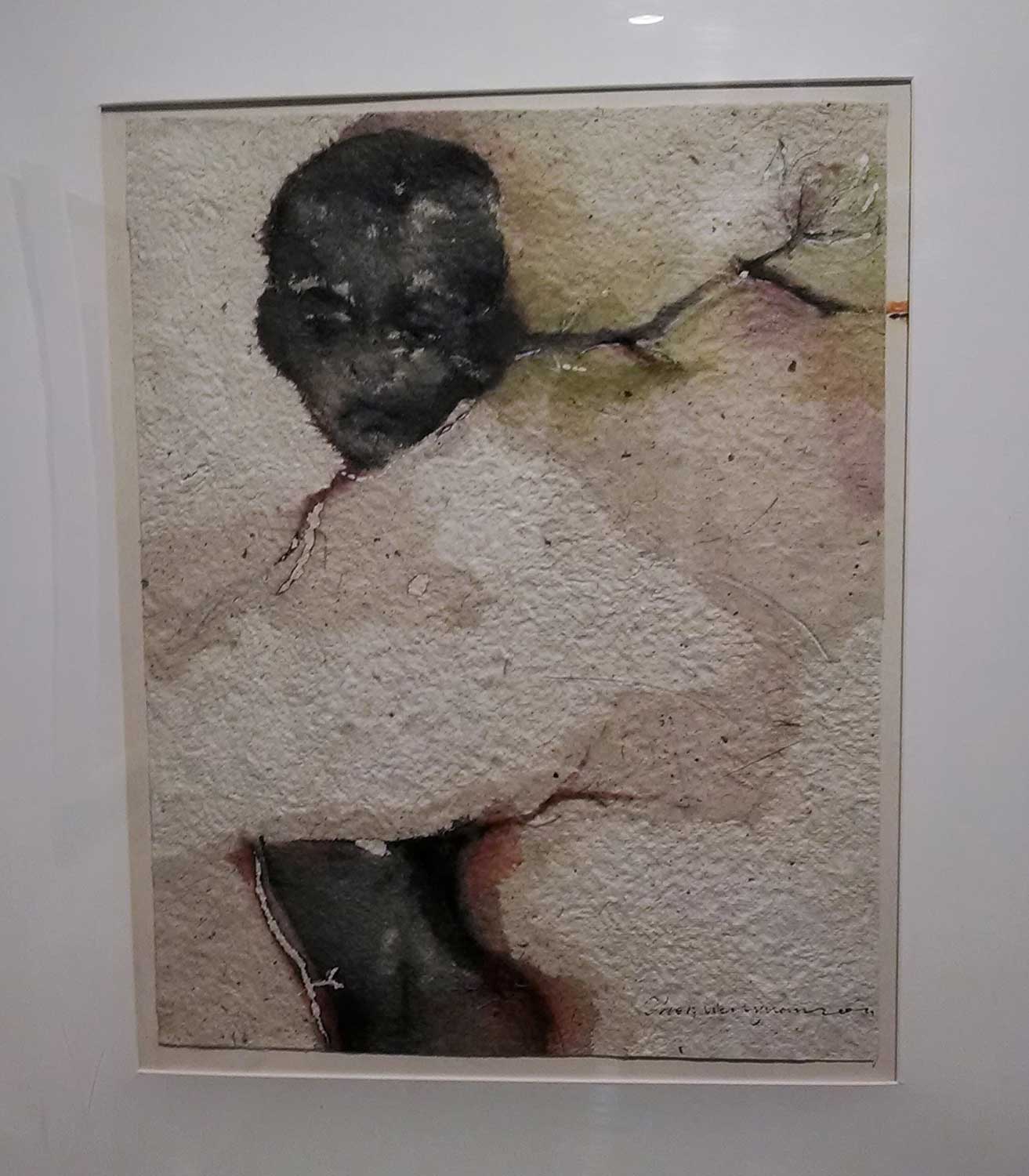
10 x 8" Watercolor on Arches cold press 140lb watercolor paper.

This is one of those portraits. Simon is the older kid and Laura wanted a painting based on one of her favorite photos of him as a toddler. I typically advise for the reference photos to have a strong light and shadow pattern, preferably in natural light and to avoid pictures taken with a flash or those with softer, diffused light, or back light. This just happened to be a backlit photo. If you are a beginning painter, it could make things difficult. The variation of values in the face becomes very subtle and you need a good understanding of facial structure to make it convincing. But it is doable and incidentally, two of my portraits I'm rather fond of have back light:

(Both of them also have step-by-step posts, here and here).

As always, I started with a thumbnail sketch:

I do this to get a general feel for the personality and mood of my subject and to give the client an idea of the end result. Sometimes I do more than one sketch, trying out different compositions, crops, colors, value schemes. Once the sketch is approved, I move on to the drawing:

You can barely see anything here because in portraits, I tend to keep the drawing minimal. I don't map out areas of light and shadows and prefer to that with paint. This drawing was made using grid method directly on the watercolor paper.

On to the next step, initial washes:

Very lightly, I mapped out main shadow areas, while leaving most highlights as the white of the paper. From now on, it's building up the layers with the general idea of keeping the color cooler in the shadows and warmer in the lights.

Some more form modeling here. Still keeping the highlights white.

Most of the time, my portrait palette consists of a yellow, a red, and a blue. Sometimes, there is an additional version of each color - a cool red (quinacridone red), a cool yellow (quinacridone gold), a warm yellow (indian or hansa yellow), and a warm blue (french ultramarine or cobalt). In this painting, I also had small areas of phtalo blue (cool blue).

Getting close to done. This image looks a bit pale compared to the previous one because of the different lighting when I took the pictures. I softened some of the edges and signed it. I felt that it was at the stage where it was still lively but not overdone. When I sent it to Laura for approval, however, she wanted a greater level of detail and depth. And so the work continued:

Working with smaller brushes, increasing value contrast (i.e. making dark things darker next to light things, which makes them pop), softening some edges.

And the finished, color-corrected version!

She loved it. :)


Enjoy the new video demo!

Here is me sketching and painting a couple of roses in a sketchbook:

A little sketch of roses to celebrate Mother's Day! I am using a Sakura Pigma Micron pen and watercolor paints on Fabriano Artistico hot press paper.

This was recorded with my new camera (Nikon D3300) which I have high hopes for: something along the lines of it filming and producing at least monthly videos almost by itself...I'm quite happy with it so far. Now, to find the time.

On a sort of related note, I have been talking about launching an online course for years and now that I have the equipment, I want to figure out what exactly this course will be about. When it comes to watercolor painting, I'm good at several things and I need to focus on one. What would you want to learn from me? I will love you forever if you let me know :)

On Ribbons

Artists are known for their big egos and I have a little bit of that. In general, though, I tend to downplay my achievements. Last year, I received several awards for my art: two at the San Bernardino County Fair ( 1st place for Plein Air at the Fair and 2nd place in watercolor painting) and 1st place in watercolor painting at the Lake Arrowhead Art & Wine festival. I didn't think too much of any of them.

Just this past Saturday, I received an "Award of Merit" at the Watercolor Artists of Sacramento Horizons (WASH) annual member show. This feels like a better achievement that I can actually brag on my blog about :). I think it's a nice intro into my artist life in Sacramento.

If I had an award acceptance speech, I'd say thank you to many of you who have been following my art, collecting it, and supporting me for years now. You know who you are and I am happy to have you in my life. And most of all, a seriously huge thank you to my husband who has encouraged me to push myself and put myself out there. I love you :) (and Happy Birthday!)

Well, Hello from the State Capital!

I cannot believe it's been over a month since my last blog post. Since we found out that my husband got the job in Sacramento and we decided to move, it was like someone pressed the "forward" button. Things moved fast.

We have lived in the new place for a week and a half now. I like it quite a lot...quiet dead-end street; a bunch of trees in the front yard; big kitchen; living area with windows, one of them huge and looking into the green backyard shaded by a spectacular oak tree; a tree house that my kids love in that same backyard; and, most of all, a wonderful garage-converted-into-a-room space that I immediately claimed as my studio. That, unfortunately, means there is no garage for us to put all of our stuff that filled a 2.5 car garage in our old house. And my poor husband doesn't have a real workshop area (the shed we have is pathetic). So it's a trade-off. Seeing that I am the one spending most of my life in this house, though, it's probably a smart trade-off. Oh yeah, and the studio can be completely locked out of the rest of the house and has a separate entrance :D . Ah, the possibilities...

Our breakfast nook window.

I am yet to set up an easel but I already have two shows on the schedule. I just got a call that I received an Award of Merit at the Sacramento's watercolor group (WASH) annual show for this painting:

Curiouser and Curiouser. 30x22" watercolor on paper.

...which was cool. This is my first award at a show that may mean anything (vs my ribbons from the San Bernardino County Fair, where I felt I had no competition to speak of). I feel good about it :) The show will run April 1 though April 19 with a 2nd Saturday (Sacramento's monthly art walk) reception on April 12 5:30 - 8:30 pm. Location is the Sacramento Fine Arts Center. You are invited!

The second show opening in May at the Kennedy Gallery Art Center is the 20/20 show and I'll tell you more about it soon :)

We are moving!

To Sacramento, that is!

I will miss quite a few of the amazing people who I met during my four years of living in the desert but I am so ready for this! I look forward to being a part of Sacramento's growing art culture (I even dare to think about a real, outside of the home art studio (gasp!)) My kids will finally have grandparents and uncles nearby (did someone say "free childcare"? :))

Unfortunately, this also means that all the classes and happenings I had planned in the High Desert will not happen and somebody else will need to take over my High Desert Art Meetup group. It's bittersweet. I am hoping that I will be able to focus instead on developing the long-promised online courses, a regular plein air and figure drawing routine, and a solid body of work. I feel that this move is a step up.

A look back at 30 Paintings in 30 Days (Round 3)

I survived :). Not only that, but I painted more than I would have otherwise. I know I was a bit too ambitious to take the challenge at this time in my life, but I'm glad I did. The daily thought that I should find something to paint, paint it, and blog about it was sometimes stressful, but mostly, it kept me motivated. I would make an effort and find the tiny pockets of time throughout the day to do what I love.

So, what's next? I plan on spending February's tiny pockets of creative time on a monument proposal for a local town (dust off those architecture skills!) and in March, I restart my watercolor painting classes. And, of course, I have about a hundred different things I want to do in-between.

Day 30 - Cape Cod Andirondack Chairs

After a short virtual trip to Cape Cod, I have added it to the list of places I would want to live in. Or at least visit in real life. And probably make more paintings of...

Today, just these two chairs overlooking a bay. Feels like a perfect spot to have a laid-back chat with a friend, or just relax to the sound of the water. Hope you like it :)

Days 28 & 29 - Abstract Landscape Watercolor Studies

Well, what can I say..In three days, I only managed to do a couple of small studies. And a few black and white sketches I won't post just because I don't have the time to scan them in. The 30 paintings in 30 days was not perfect this time around, but I did try and for that I'm proud of myself :). I am hoping to do another painting tomorrow for the Virtual Paintout, which is in Cape Cod this month.

On a different note, I am slowly getting back into teaching and will start classes in March, at the newly-expanded Burning House Art Studio in Apple Valley. I'm rather excited about that.

Purple and green study #1

Purple and green study #2

Day 26 - South Lake Redux

Wet-into-wet full sheet yet again. I wanted to try a vertical format and a more uniform foreground. Everything is still wet, so it will look a bit different when it's fully dry. I like the process...always loved working wet-int-wet and doing it on a full sheet feels good. I may even pull out the roll of Arches paper I have and go bigger. These should look good in interiors, even if there is no huge mystical meaning behind them ;)

south-lake-2.jpg

Day 25 - South Lake

A full sheet today. Sunrise at the South Like from Bodhi's Lake House. An interesting discovery is that something like this is quite doable as a daily painting...Hmm..Do I see a month of sunrises and sunsets in the future?

Watercolor on Fabriano Artistico rough watercolor paper. 22x30".

A baby and my feet for scale and a glimpse into my studio reality :) :

Day 24 - Casa Del Desierto (Barstow Harvey House)

Finally done with this painting! I started it on a plein air outing over a week ago and worked on it in tiny pieces of time since. It even went through an ugly stage (which is normal, particularly for paintings done in multiple sessions) and through a husband-critique stage (that's how you know it's getting serious ;) ). I

Watercolor and ink on hot press paper. Original sold. Prints and cards available.

A few progress photos:

IMG_20140114_161127816.jpg

First step: completed drawing at the plein air session. By the time I was done drawing, it was getting close to sunset and windy, so I decided to do the painting part at home.

harvey-house-progress.jpg

Here, I am beginning to lay first washes. The paper is hot press, so I'm getting some nice blooms!

harvey-house-ip3.jpg

I have some white areas left here but most of the painting has a layer of paint. Evaluating if the contrast between the white columns and dark spaces between them is too dark. So it is. Also, not crazy about the foreground.

harvey-house-ip5.jpg

One step further: I toned down the white areas and lightened up the shadows between columns. I also decided to separate the far right side of the building from the background by darkening the tree area. The foreground got another wash of gray-blue to tone it down and ground the building. Brick detail on the left side and a bit of cleaning up in the shape of the columns and bottom of the building.

harvey-house-ip4.jpg

At this point, I got a feeling that my problem with the foreground might be because it was also too large. I began thinking about the best way to crop it.

Harvey-House.jpg

Final, cropped version. The foreground is significantly darker and quieter. I took off some of the paint first, by wetting the area with a soft brush (to agitate the paint and make it liftable without damaging the paper) and blotting with soft tissue paper (like Kleenex). I repeated the process once or twice. Then, I covered the area with a fairly uniform wash of mixed gray (French Ultramarine + Quinacridone Red + Quinacridone Gold).

And that's the story :). I think I've lived in the desert for too long (4 years!), because I am beginning to find cool things about it and even like some of them...

If you would like to see an excellent virtual tour of the Barstow Harvey House, watch this:

Day 21 - Mimi's Cafe watercolor sketch

We went out on a date yesterday, also known as "let's-go-eat-food-I-did-not-cook" :). I brought along a sketchbook. This was the view from our booth...rather charming, with the chandelier, the oval mirror in an ornate frame, the little photographs and the big paintings on the walls. First thing that drew my attention, though, was the quiet and cozy quality of light. I tried to infuse the sketch with it. What do you think? Can you feel it?

Day 19 - Impressions from LA Art Show

Miss me yet? "Life" won over again in the last few days and I have made only very slow progress on my Harvey House painting. My head, however, is plotting new paintings since my visit to the Los Angeles Art Show on Thursday! It was good. An artist friend of mine came along and I enjoyed a dialogue on all things artistic and artful. We spent several hours absorbing the beauty and studying the skill of top artists throughout the world. We discovered new favorites. Quite often, I found myself wondering why a particular piece was selected for this show.

It was fun to hear a lot of languages along with English spoken with all kinds of accents. I even began feeling not accented enough :) Obviously, to be interesting in the American art world, you need to be a bit exotic.

It seemed that oils, other than in the Chinese section, dominated the show. The Chinese had a large percentage of works on paper and I found their large abstract ink paintings on rice paper fascinating. I saw a couple of watercolors in traditional/historic art section (plus a gouache by Van Gogh). All of it rubbed in the (usually unsolicited) advice that I get from people: 1) switch to oils and 2) paint big.

I found myself drawn to figures (mostly in contemporary traditional and modern sections) and to abstracts. Of course, I already discovered that I like both last year when I went through an exercise of clipping images that resonated with me. Now I just need to figure out how to reconcile them in my own work...

Day 14 - En Plein Air, En Progress, and a Yucca

Today, I spent a couple of hours at one of the local landmarks, the Barstow Harvey House, also known as Casa Del Desierto. It was one of my scheduled paintouts with the High Desert Art Meetup. The meetup was a bit on the lonely side, as nobody except me showed up, but I didn't mind that too much. I was able to really focus on the drawing, which is probably why I spent around an hour and a half on it and didn't have time to paint and dry it.

So, I plan to finish that painting tomorrow. Meanwhile, here is another painting from a paintout a week ago. I added the background at home.

22 x 15" Watercolor on hot press paper.

22 x 15" Watercolor on hot press paper.

Day 13 - Lunchtime

Warning: this post also has a baby in it. Or, rather, a toddler. Because I can't post today's painting without telling you how Katia (our 1.5-year-old), while I was blissfully finishing the painting, took my bottle of sepia acrylic ink and spilled it all onto our living room floor (tile, fortunately). She then proceeded with multi-sensory exploration of the puddle of ink (full bottle, by the way...I only started it today). By the time I snapped out of my zone and began wondering why she was so quiet, she had ink on her face, in her mouth, and all over her body.

14 - 1.jpg

So...moral of the story? Don't have kids Don't leave your stuff where a toddler can get it and never ever let yourself be lulled into thinking you can do your own thing while the toddler is awake. A bit sarcastic...I'm sure I will remember these days fondly one day.

As for the painting, I finally tried something I wanted to for some time: the ink + watercolor method but on a larger scale. I used a half sheet of paper and a brush to apply ink. It was actually pretty fun! I don't have as much control of the brush line as I do of the pen when I work on a small drawing, so this was a bit out of my confort zone. But I liked it.

22 x 15 " watercolor and ink on hot press watercolor paper.

22 x 15 " watercolor and ink on hot press watercolor paper.

Day 12 - to France!

At least, virtually for now :) I got a few reference photos of windows and doors from Bix of France Painting Holiday and used one of them today. Not crazy about the result but happy that I actually managed to paint some. There are things I like and dislike about this painting, but in general, I declare it a dud, a stinker, a wiper. Any other terms for unsuccessful painting attempts? Often, my "wipers" turn into experiments (since I already know it can't get much worse, I'm not afraid to mess it up with wild ideas). On this one, I want to do a few things...One is to apply gesso with a bristle brush (for texture) over the timber and freshen up the color on top.

window-sketch.jpg

Day 11 - a few sketches from the days before

Things get crazy, no time for anything, etc. Here is a sketch of baby Ella (who is already 2 months old!):

ella-2-months.jpg

And an animated gif of her created by the almighty Google through their awesome Auto-Awesome feature. I am having all kinds of fun with it. (Sorry if you hate pictures of babies...I can't help it! I promise I won't do it very often, though :))

IMG_20140110_080233379-MOTION.gif

The second sketch below is something I made based on a picture of a woman walking through an alley. Initially, I just liked the figure and the tall buildings around her (which were not dark or menacing in the reference photo). As I worked on it, though, it began morphing into an abstraction more and more and taking on a darker mood. I'm not sure it's finished. I like the transparent layers but I also want to see how far I can push it into abstraction and darkness. We'll see...

alley-of-shadows.jpg

Day 8 - An Orchid

I have two orchid plants that somehow survived several years in my care. "Survived," because I am definitely not known for having green thumbs, and anyone looking at my front yard will be able to tell that :). But these things...they keep being alive and making me happy with gorgeous flowers. One of them just opened its first bloom of the season and I enjoyed painting it this morning.

Watercolor on Fabriano Artistico hot press 140lb watercolor paper. 5.5 x 7.5". Special price of $50 until February 1.

Watercolor on Fabriano Artistico hot press 140lb watercolor paper. 5.5 x 7.5". Special price of $50 until February 1.

Speaking of blooms, also known as backruns, or bleeds, or even cauliflowers - I like them. I don't always create or keep them but in general, I think they are fun. If you like them, too, and want to make them happen in your painting, the secret is using lots of water when you paint, so that you have puddles of paint. Additionally, hot press paper is more bloom-friendly than cold press.