Here's another good thing about having a full time job - I can now sort of afford to travel once in a while. At least once a year. And judging by my bucket list of places to visit, I will run out of years before I run out of places...so I really need to pick up the pace!
A fair number of places on the list are in the U.S. - like Seattle. This trip just sort of happened, after my husband saw an airfare sale from Southwest airlines. So we consulted the bucket list and cross-referenced it against the destinations on sale and that's how we got Seattle.
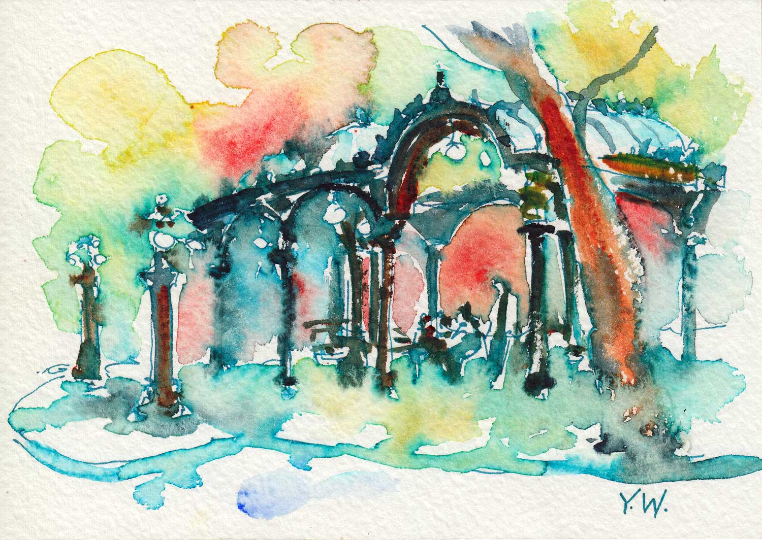
Pioneer Square.
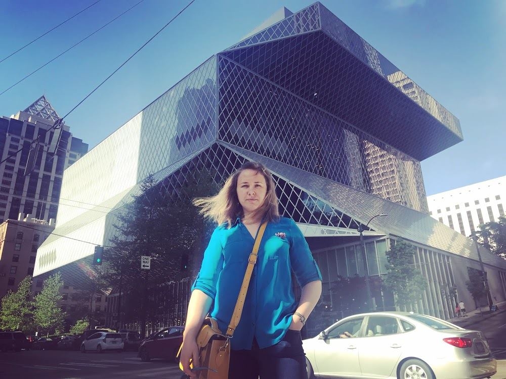
Coming out the airport and riding the light rail to the city, Seattle felt very much underwhelming. But over the long weekend we spent there, it grew on me. We caught three days of "sucker weather" - sunshine and blue skies, which, according to my Seattle-native colleague, is the kind of weather that makes people move to Seattle and then immediately goes bad after they do.
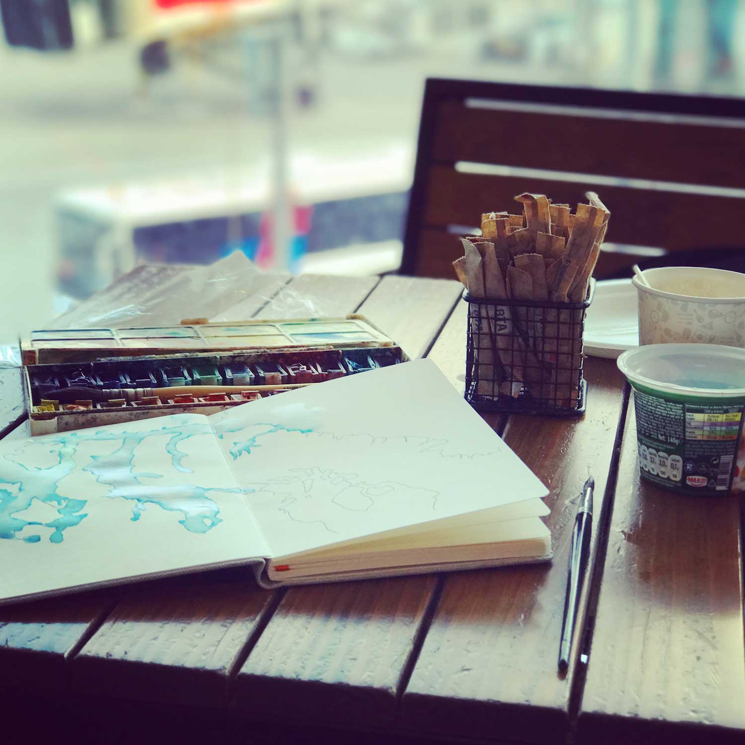
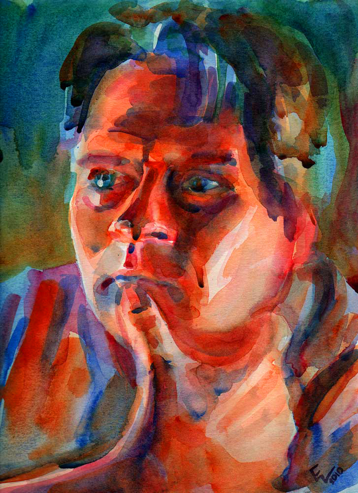
I got to test drive my extremely compact sketching kit, including the brand new #14 Da Vinci travel sable brush.
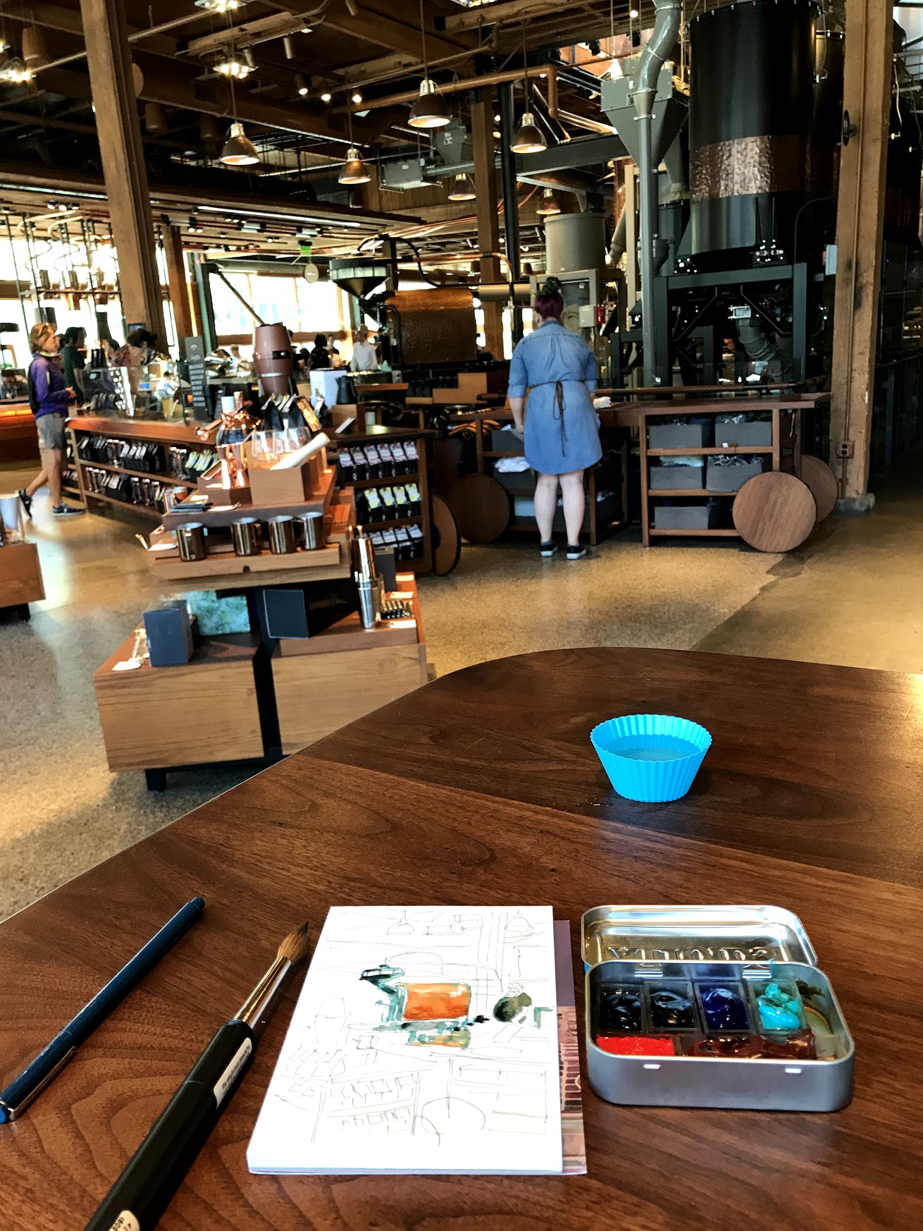
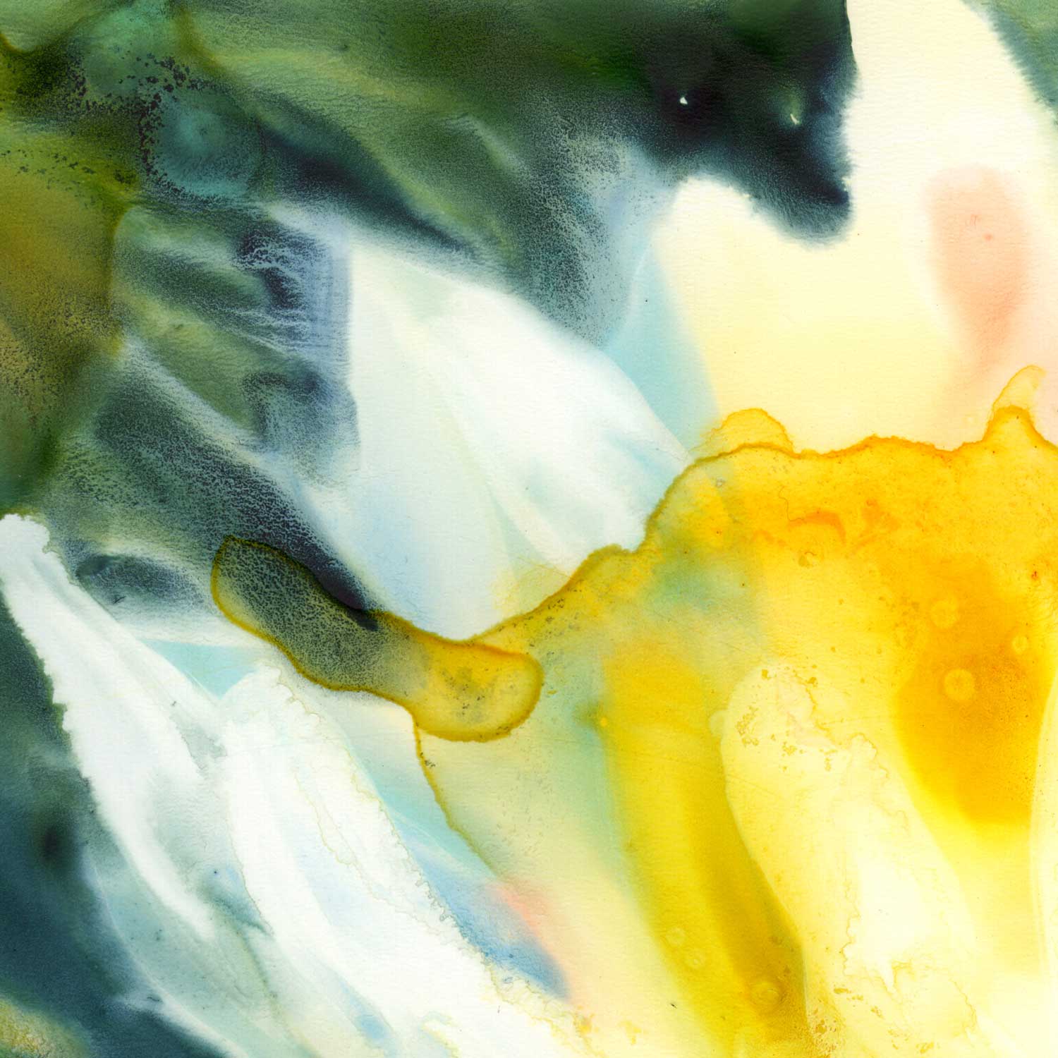
Sketching at the Starbucks Reserve in Seattle.
My current ultra-compact travel palette is shown below. There is no complicated method to my choice of colors here...this is just what I felt like at the time I assembled the palette. The favorites:
- W&N French Ultramarine
- W&N Quinacridone Gold
- Daniel Smith Quinacridone Sienna
Plus the moody dark blues from Daniel Smith, a brilliant vermillion from Schmincke and a fun cobalt teal from Utrecht. The Indian yellow (included in the photo) didn't make it. All of this fits into an Altoids tin.

I was a little worried that the TSA would make me pull out my paints and explain that they are not drugs...But they didn't. Instead, they pulled out a pocket knife out of the depths of my bag. I have a habit of bringing pocket knives to airports...During the trip to Ukraine last year, my pocket knife made it all the way to Istanbul, where it was finally discovered at the security checkpoint and confiscated. It was a good one, too...
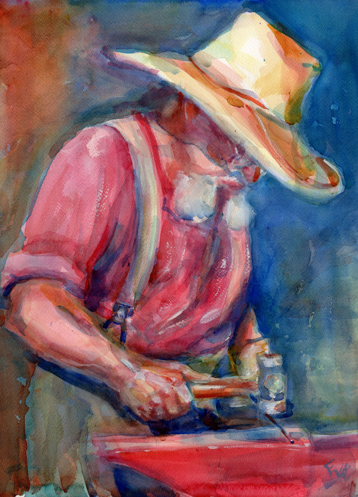
Anyway, the trip. I like to take it easy if I can and balance the must-see destinations with random stuff you just walk into. One of my friends recommended that we visit the Fremont neighborhood (not to be confused with Fremont near San Francisco). There were a few things I wanted to see, like the Troll Under the Bridge and the surrealistic and absurd in this context statue of Lenin. And then I just found myself in an antiques store, right next to the center of the universe:

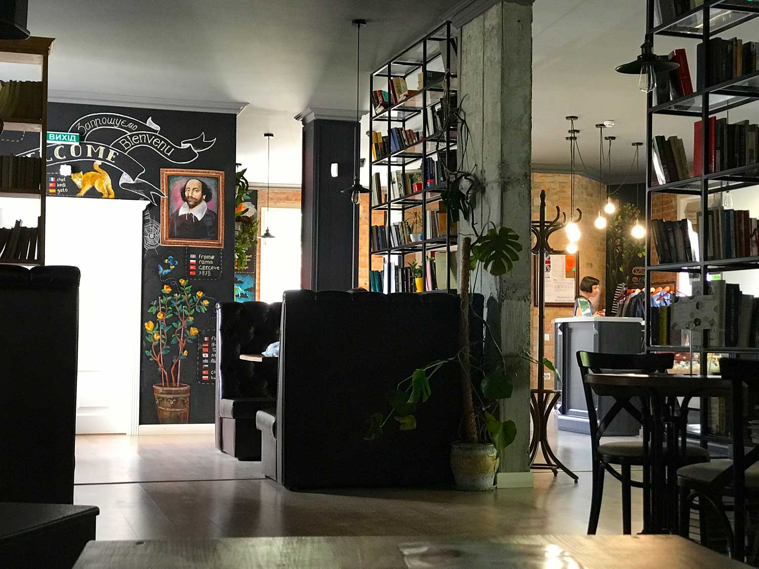
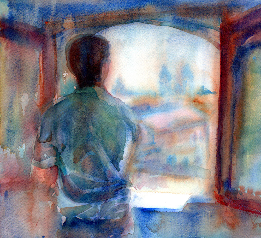
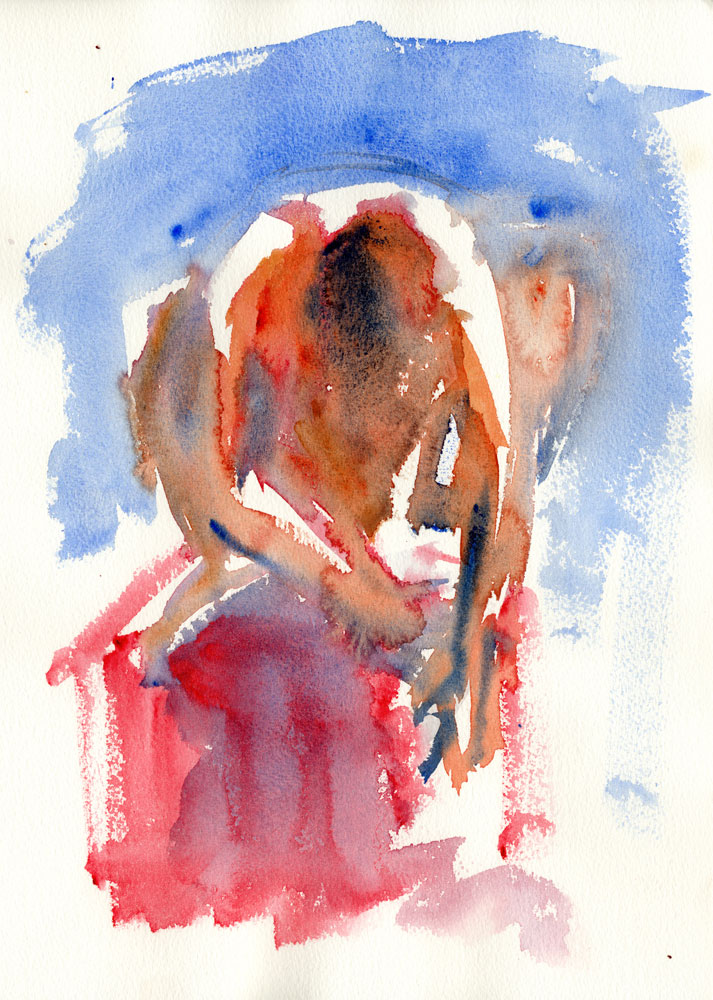
The store turned out to have a nice collection of vinyls and I left with several of them. Pretty soon after that, we stopped at a Starbucks, which interested me mostly for the promise of a bathroom but actually had a very nice second floor seating area with windows onto the Fremont bridge. Which I, of course, had to sketch.
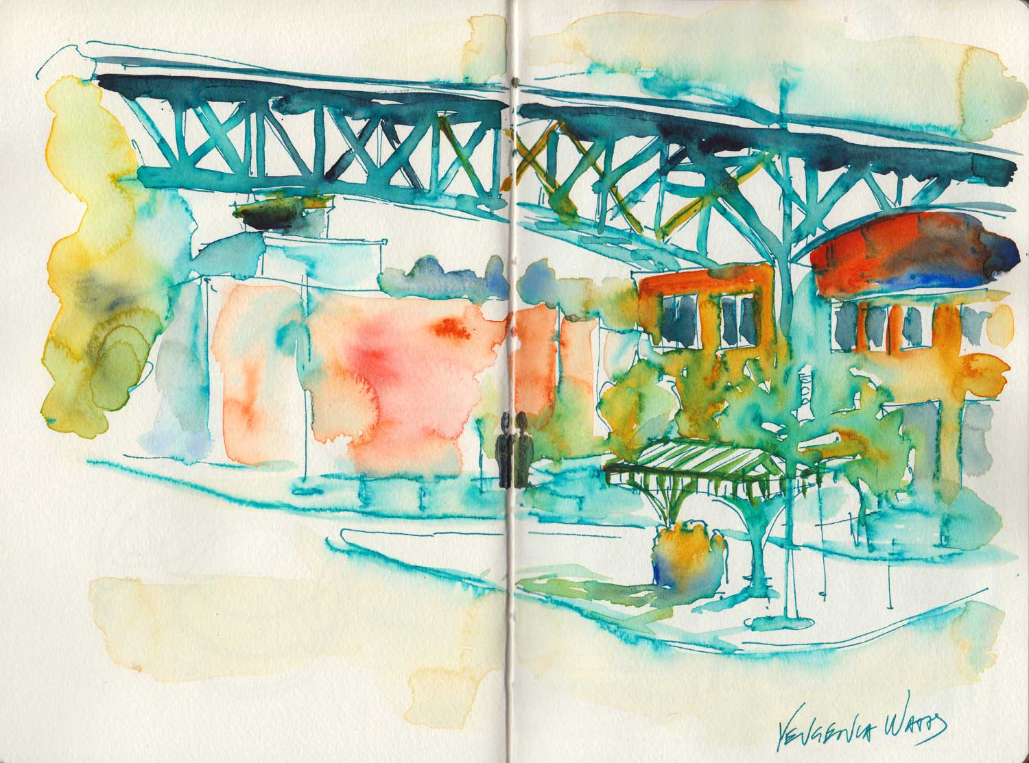
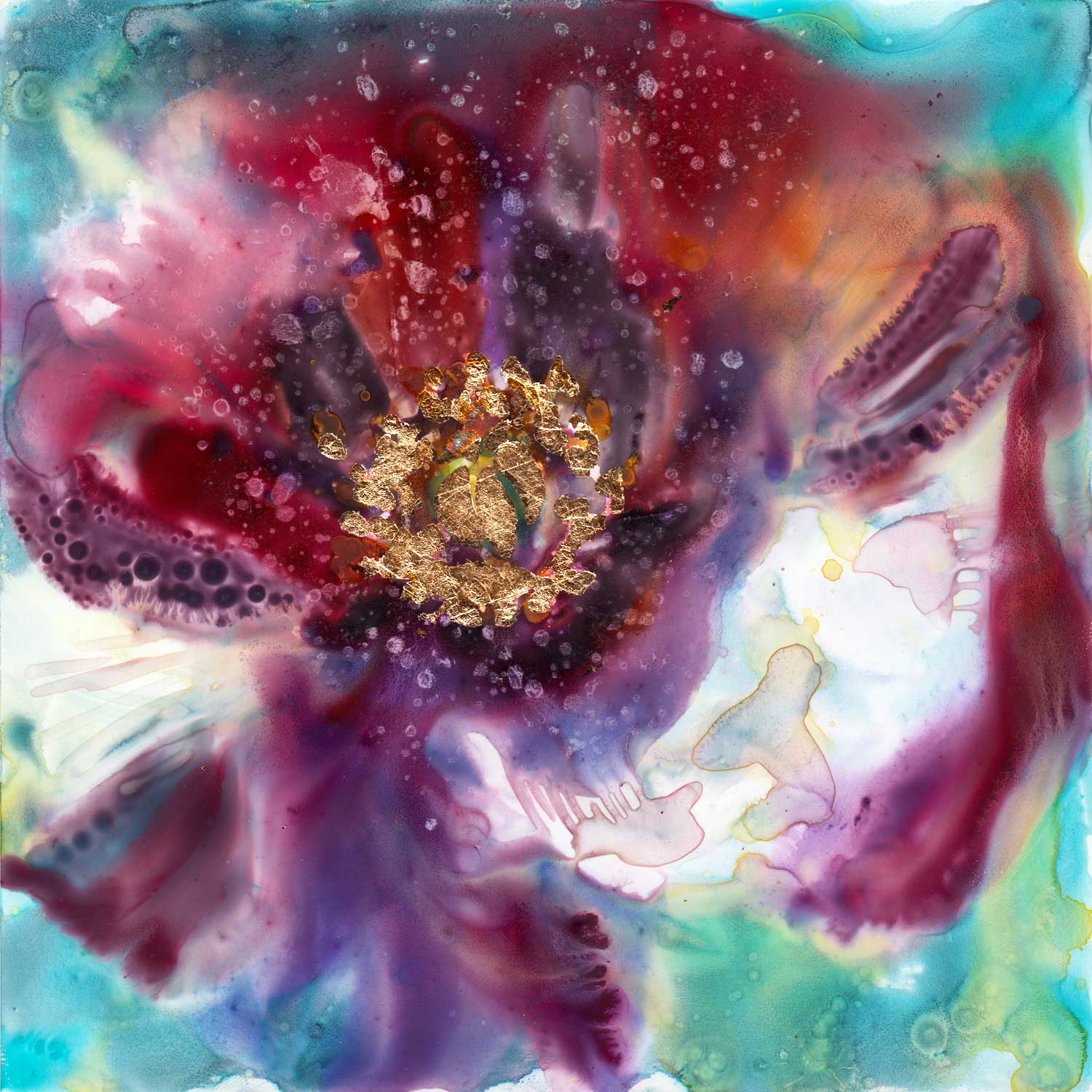
Fremont Bridge.
I learned from a shoe sales guy that there was a curious restaurant called "Pink Door." This restaurant, he said, had live entertainment in the evening. And good seafood. What else is there to want in a restaurant? Dinner was decided.
As it turned out, the pink door was the only marker of the entry into this restaurant. There was no sign above the door. Just an old light pink door. You open it and voila, you're in the restaurant.
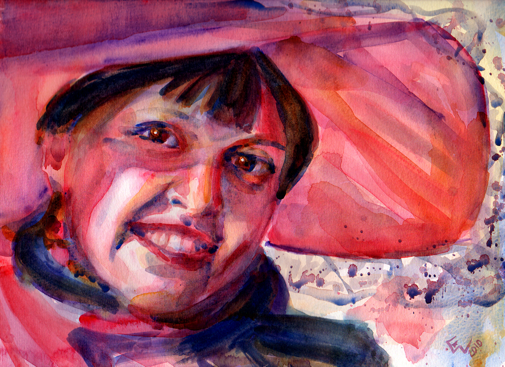
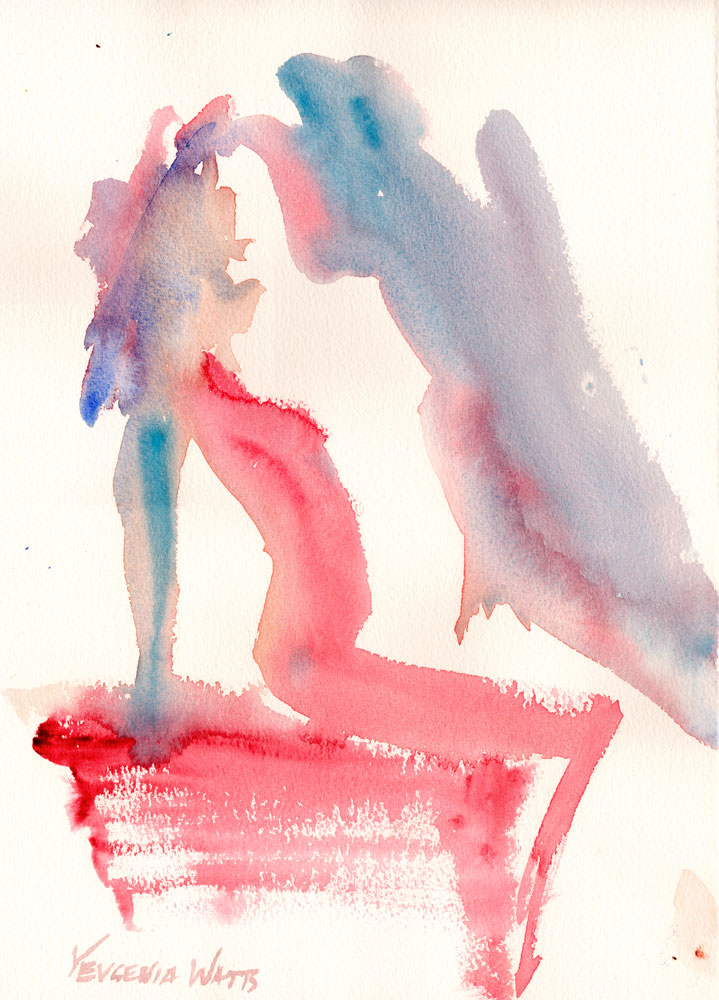
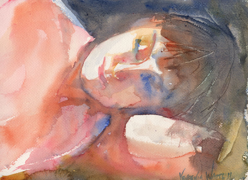
The food was superb. We sat at the bar, as all the tables were taken, and enjoyed our seafood with local drinks. The promised live entertainment came, and it was a performance by an aerial gymnast. Additional live entertainment was supplied by our neighbors at the bar - a recently divorced lawyer and her brand new friend who owns an art gallery.

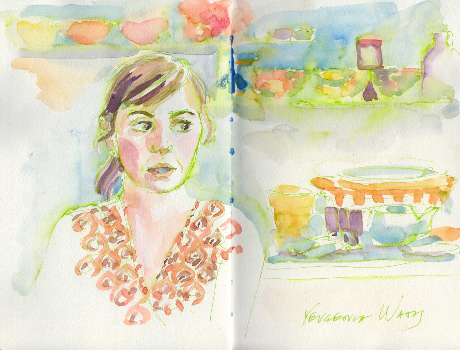
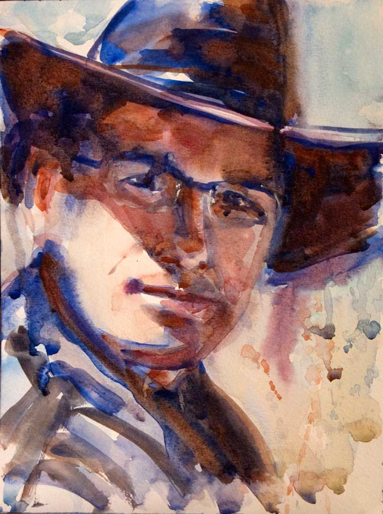
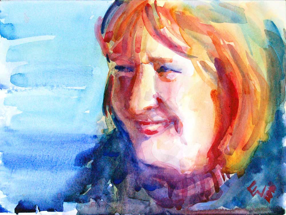
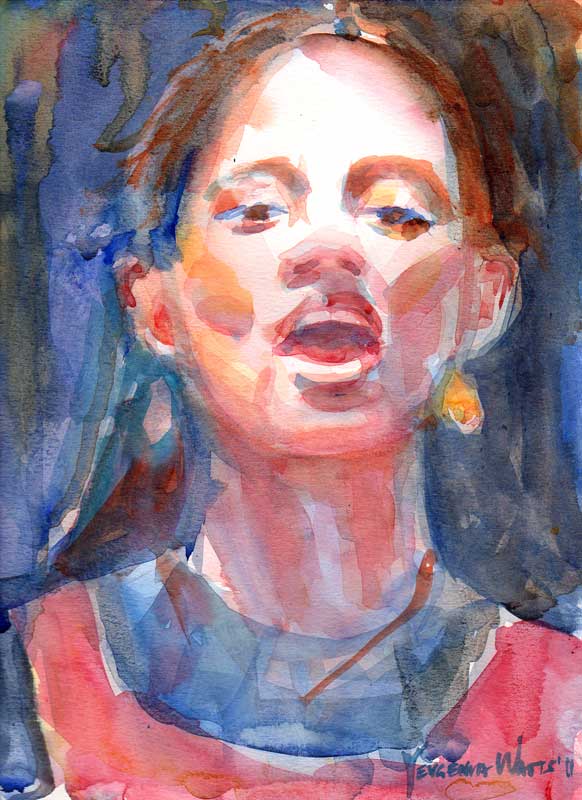
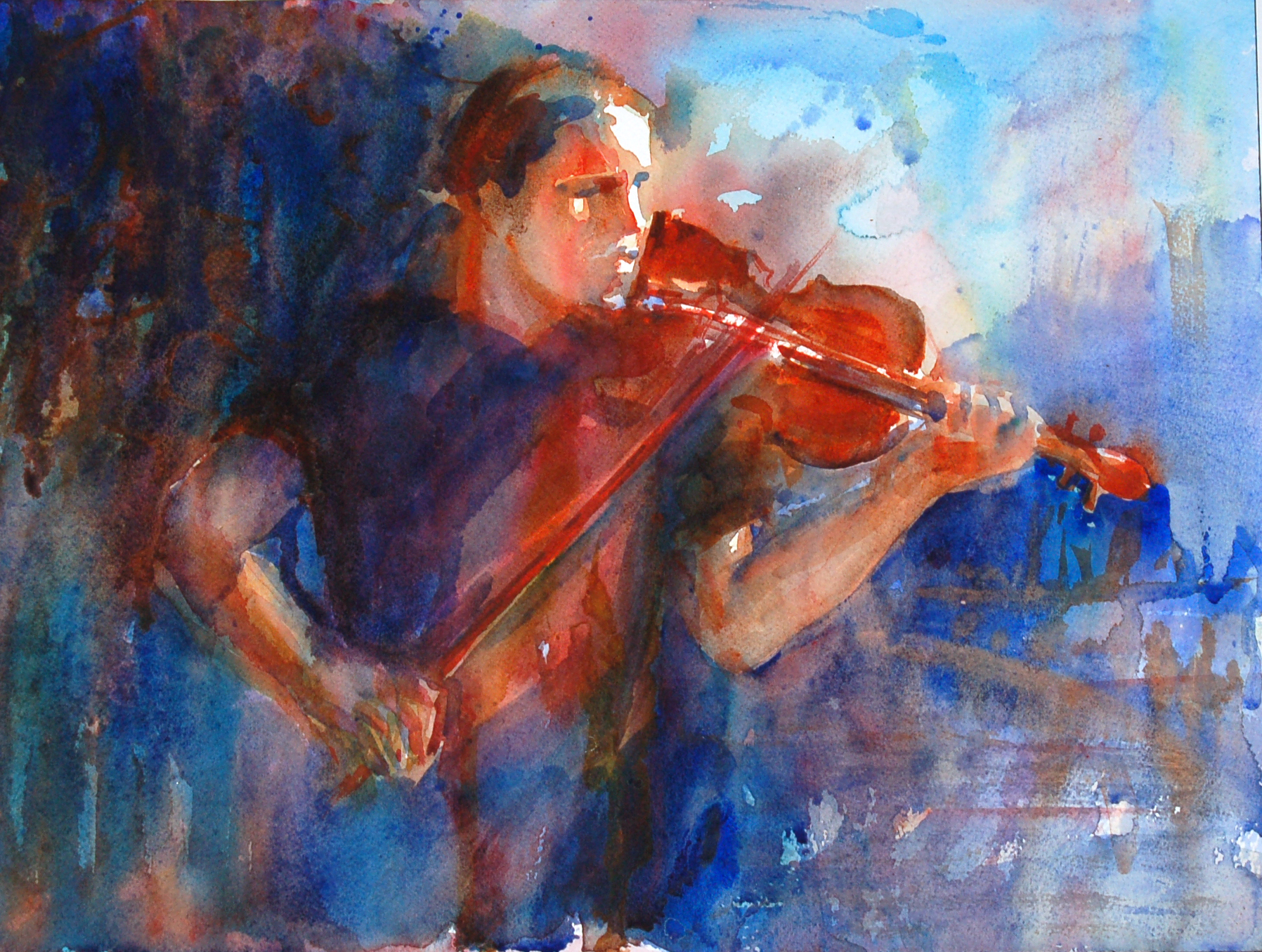
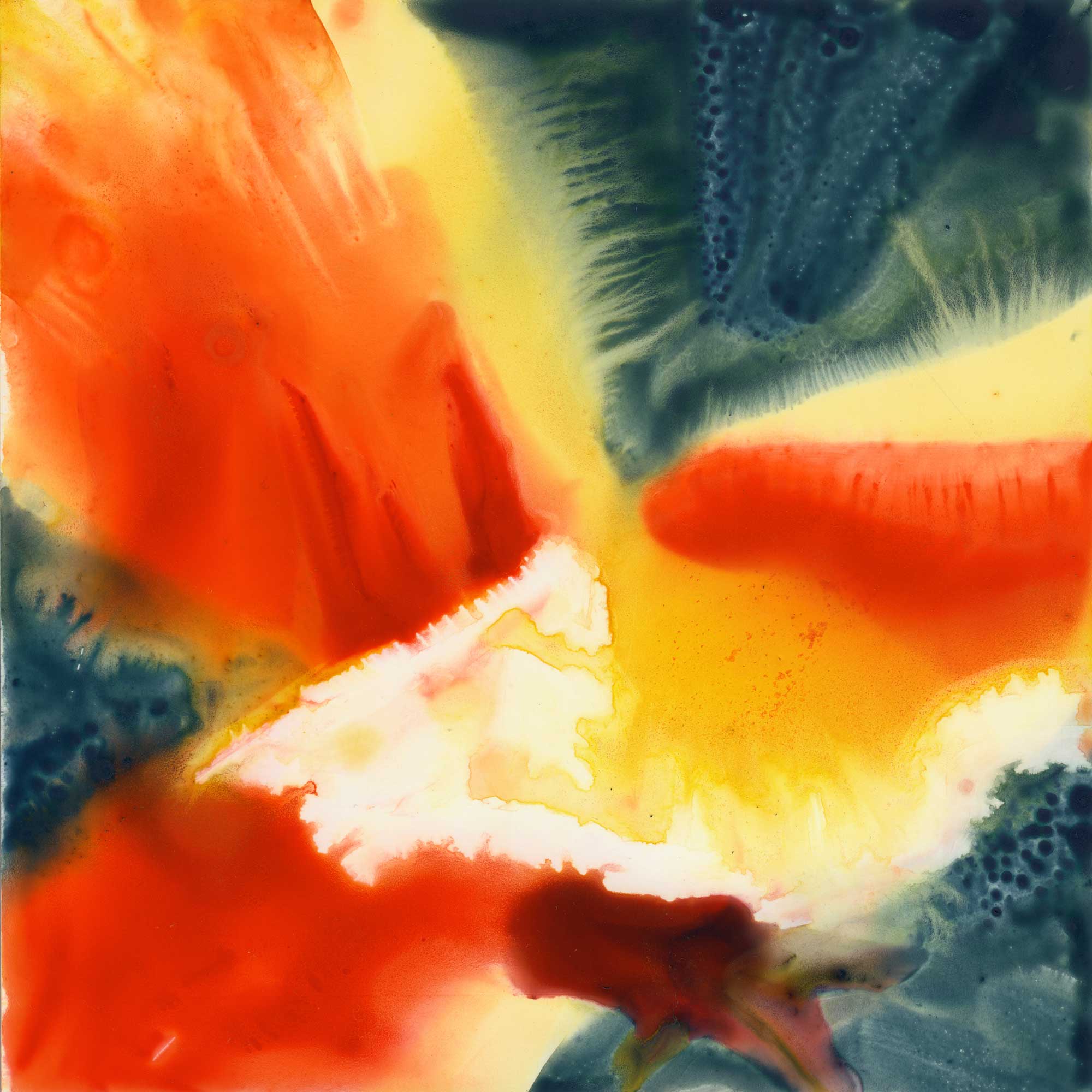
The bar at the Pink Door restaurant.
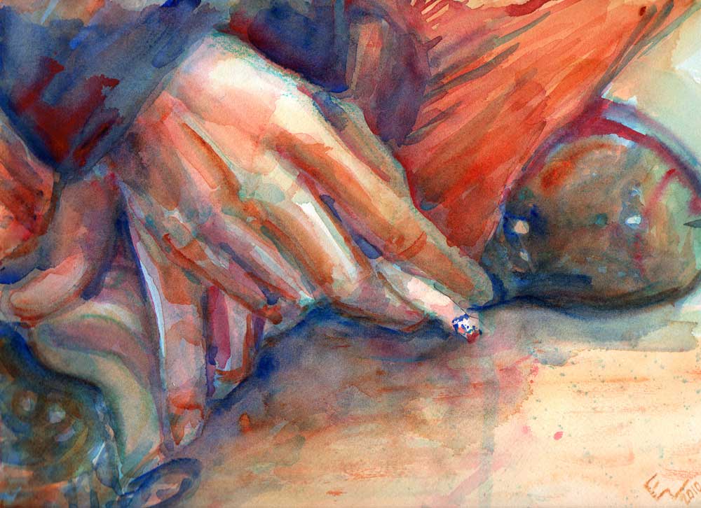
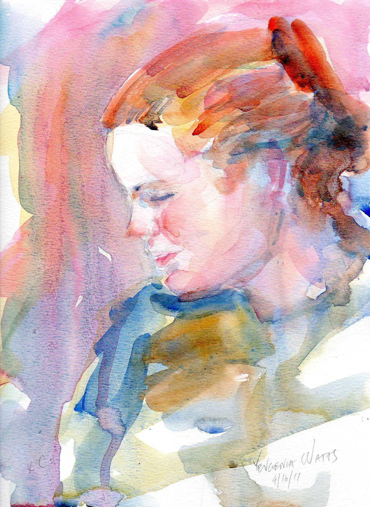
I sketched while I waited for the dinner and then added paint later that night. I couldn't sleep that night, because...sleepless in Seattle? :)