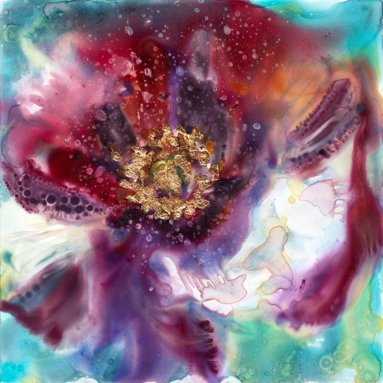
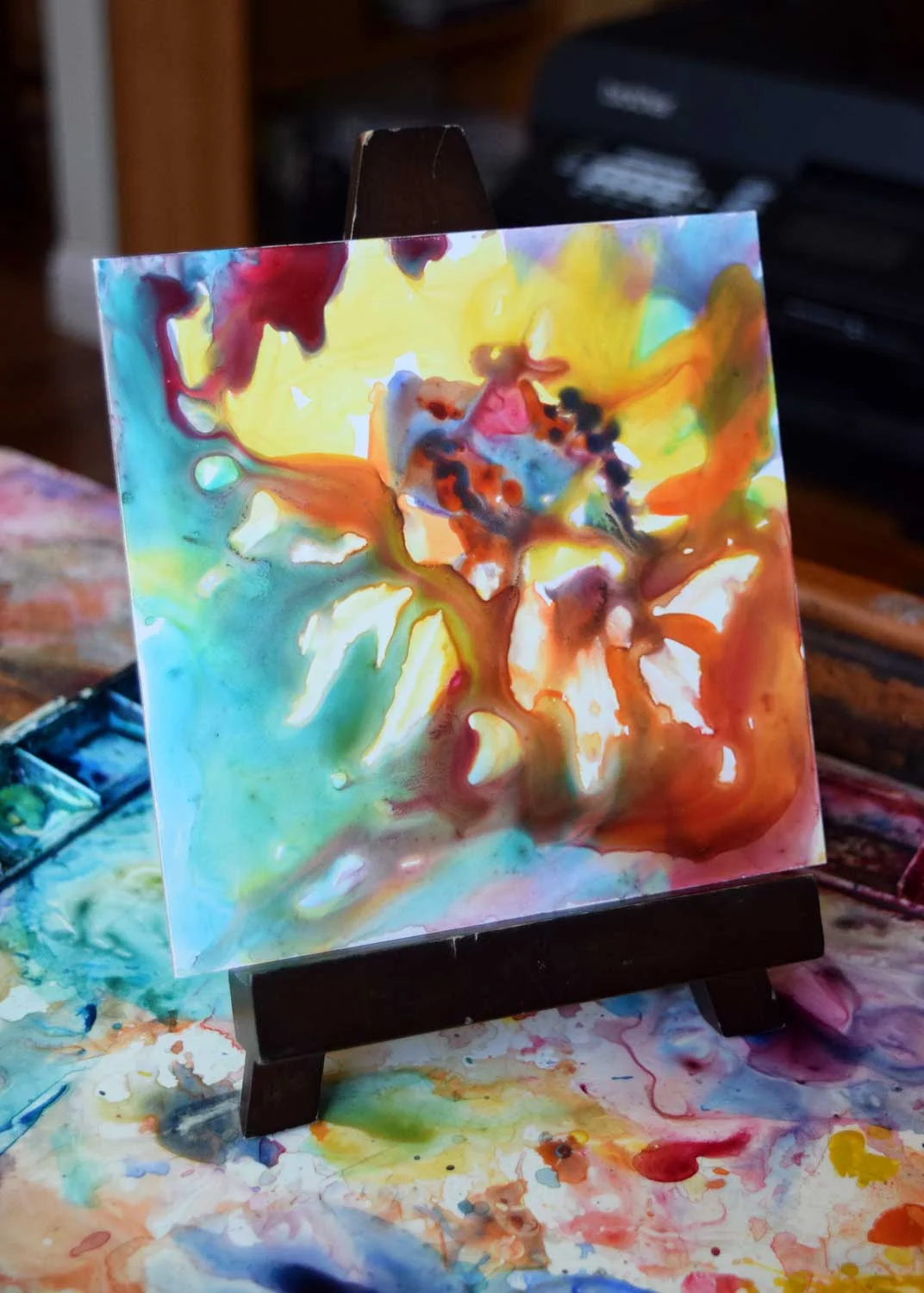
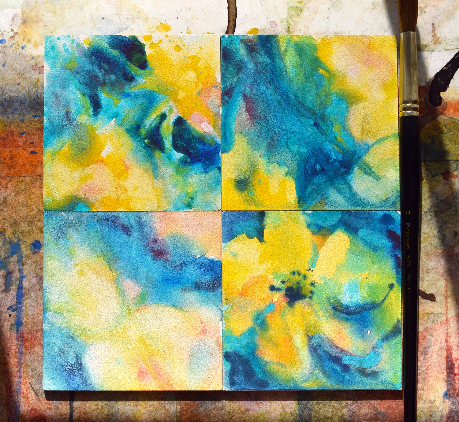
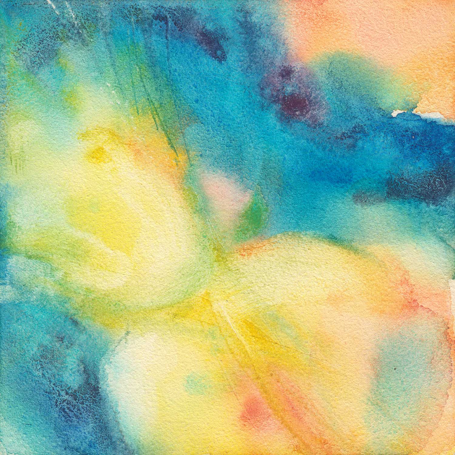
Today, yet another variation on the tulip tree theme. The technique in this one was:
1. Wet the whole surface (even though, because it is yupo, it doesn't stay uniformly wet. Water pools in some areas and leaves others practically dry).
2. Apply liberal amounts of watercolor paint. Here, I used quinacridone red, cobalt turquoise, quinacridone gold, and phtalo blue (See more information on the colors on my palette here).
3. Wipe most of the wet paint away with a "thirsty" brush.
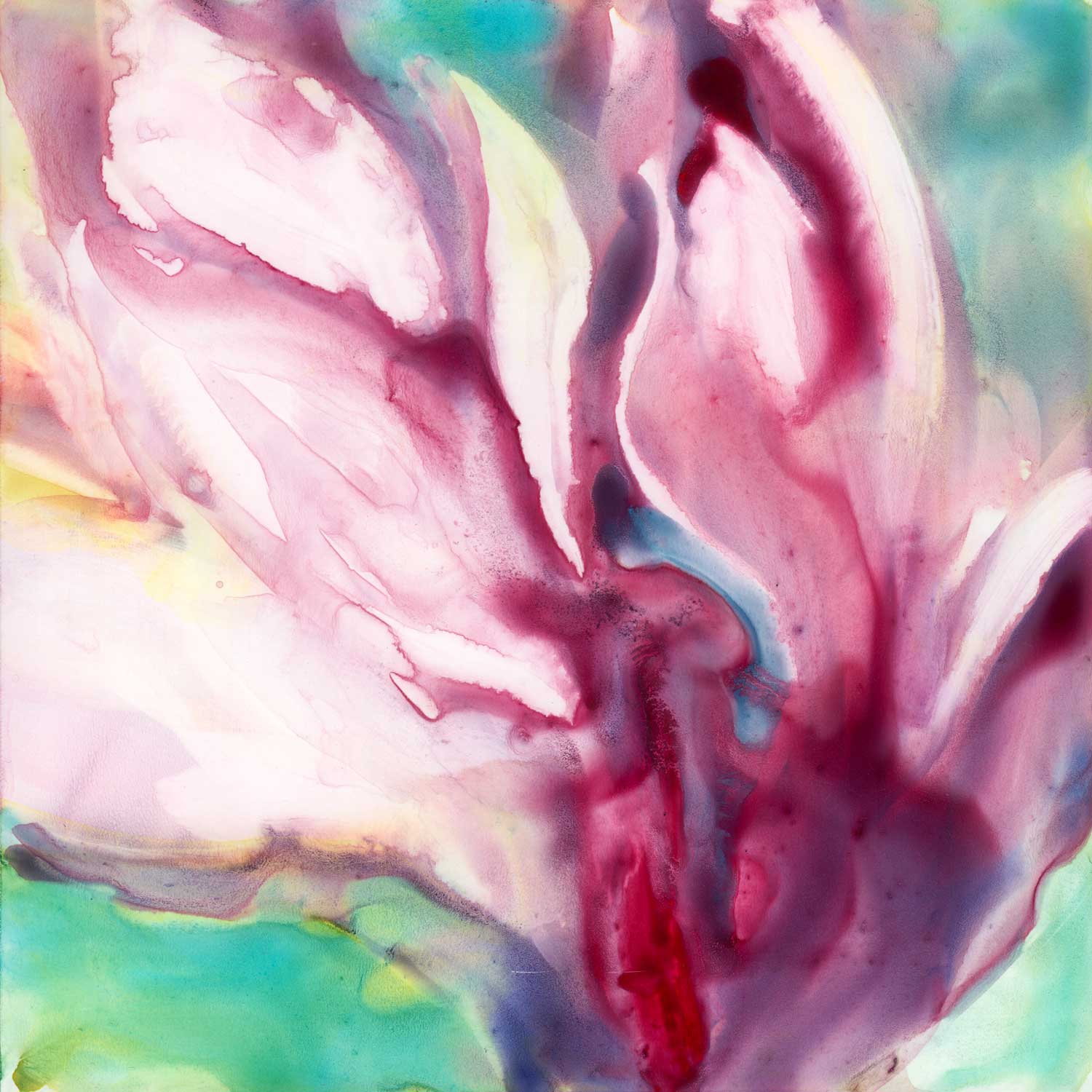
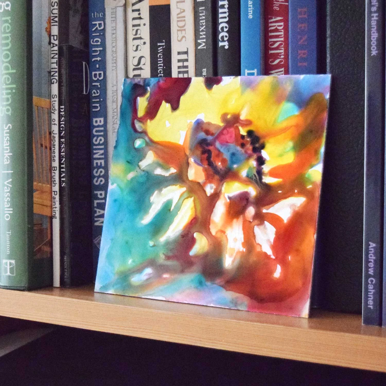
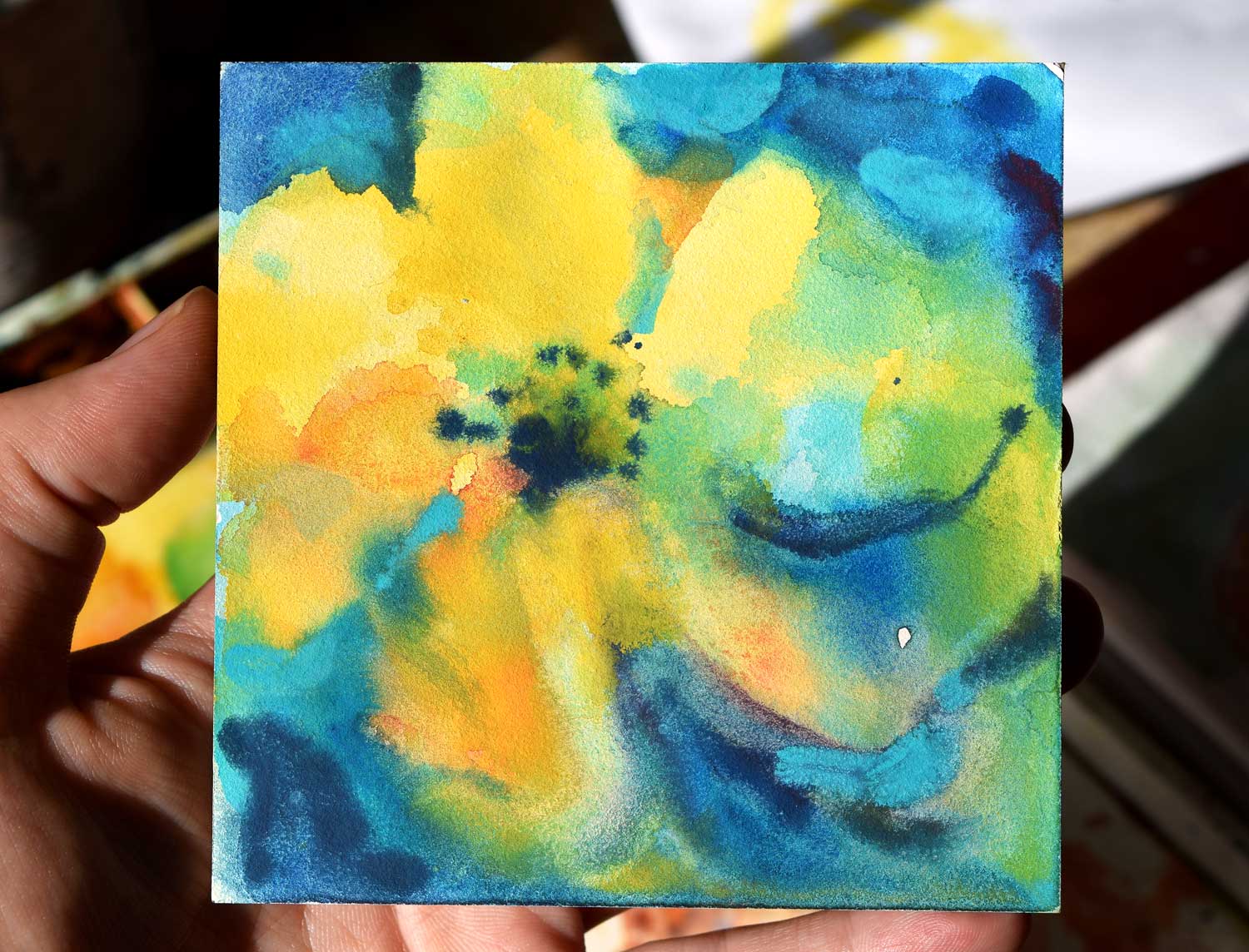
"Into Light." 6x6" watercolor on Yupo mounted on board. Click on the image to learn more.
What's a "thirsty" brush, you ask? It's any brush you want, but it has to be:
1. Dipped in water and
2. Squeezed out, either using your fingers, a rag or a paper towel.
Basically, it's a brush that is not dry, but is primed with water. It is perfect for picking up the paint you might not want on your painting. I like to use round brush for that but any shape you prefer is fine, too.

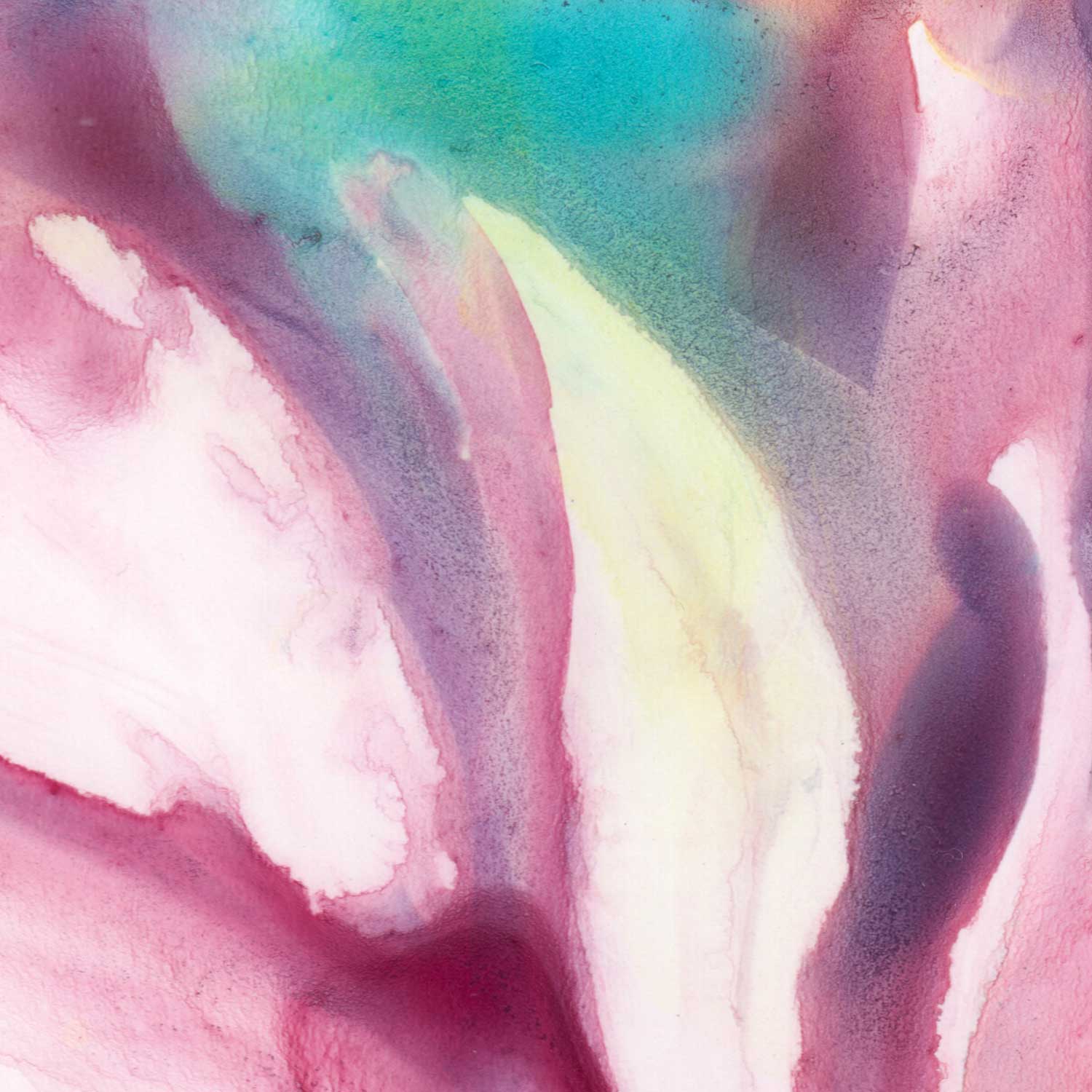
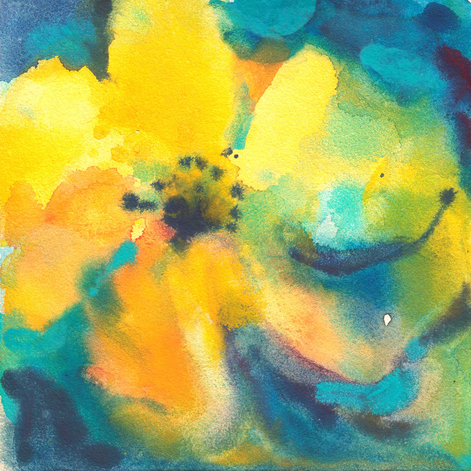
The closeup above shows how much paint there was initially. This is a spot which I left alone after putting paint down.
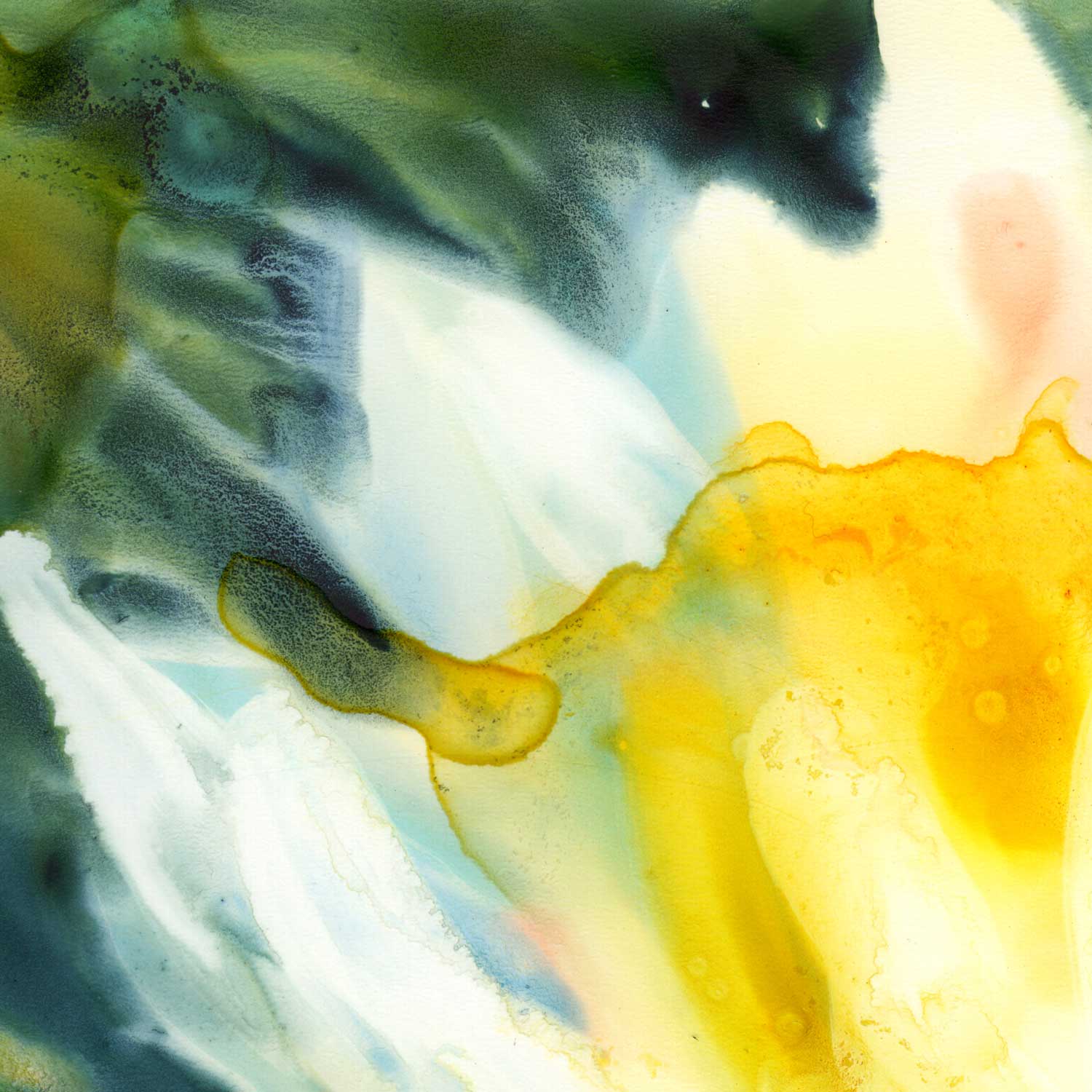
Closeup below: areas where I wiped the paint off still have ghosted traces of the colors that were applied. I really like this effect in Yupo.