
Tell somebody else about me and let me know where you did it! Details here.
How to use artist's tape
in art tips, commissions
I discovered artist's tape not in a class or workshop but by a kind of accident. When we were learning to make our own giclee prints, we bought artist's tape to attach the prints to the back of the mats (which works very well, looks neat and can be easily disassembled). Recently, I started using artist's tape to block off the edges of my paintings to give the finished work a clean and professional look. I also used it for lifting off very thin lines in one of my recent paintings and, of course, for picking up areas masked out with liquid frisquet. The following step-by-step guide is one of the most popular applications of artist's tape - to give you a straight edge separating areas of different color in a painting. The painting I am working on is of the new building of the Mississippi Blood Services. It makes me think back to my first years in architecture school (nothing to do with blood..just the hands-on approach to architectural renderings). So, here I am going to do a gradated wash that represents the sky, while blocking off the edges of the building with artist's tape. Here is the drawing:
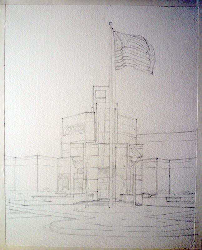
mbs in progress 1
I need to cover the flag and some smaller elements with masking liquid:
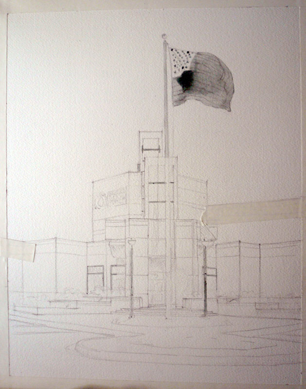
mbs in progress 2
I decided to mask out the stars on the flag but leave the blue area of the flag open to the wash. This way, I will be able to achieve more unity within the painting. Enter the artist's tape:
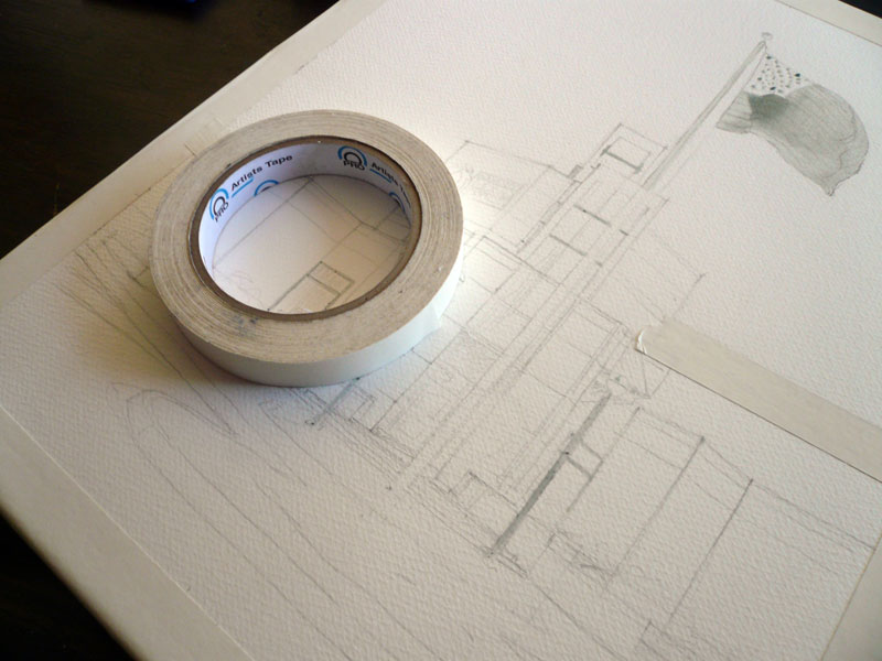
artist's tape
I applied the tape along the edge of the building that meets the sky. I also blocked off the top middle section of the building, so that I don't accidentally paint over it when I make the horizontal strokes of the sky wash. Make sure the edges where you need the straight line are completely attached to the paper. Otherwise you might end up with paint leaking under the tape.
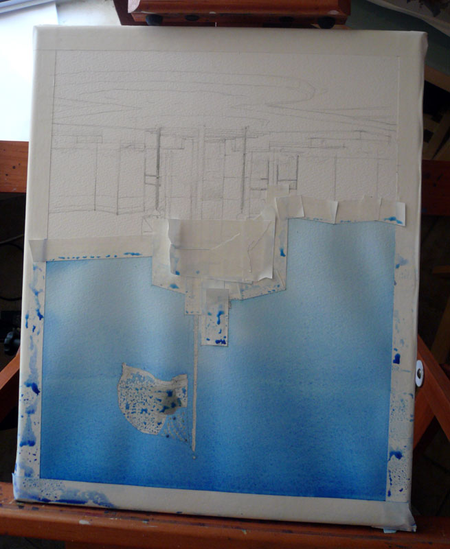
mbs in progress 4
I apply the wash upside down and keeping the painting at a slight angle. The color is a mixture of ultramarine blue, phtalo blue, and a little bit of verditer close the horizon - which, in retrospect, was not such a great idea. Phtalo blue is transparent and non-granulating. Ultramarine is almost transparent but quite granulating. As a result, my wash wasn't completely even and I had a couple of stripes of ultramarine blue that separated from the mixture and decided to go their own way. I almost scrapped the painting and started all over - but went ahead and applied a couple more washes to see if that would even everything out. To my surprise and delight, it did. I applied several gradated washes of ultramarine and phtalo blue, using only one color at a time. The result is this:

mbs in progress 5
Not ideal, but definitely better and I don't have to start over! I also like the deepened color quite a lot.
Final tip on the artist's tape - before putting it down on paper, stick the piece of tape to your clothing (something not very fluffy or furry), like your jeans, and then apply it to your painting. This will make it a little less sticky and minimize the chances of you removing paint or damaging the paper when you lift it off.
Like I said, this is just one of the many, many ways to use artist's tape. What's your favorite? Do you have a secret trick involving artist's tape? Please share :)
Genia Awareness Month
So here's the idea. We decided that it is time to bring my art into the masses by launching an artist awareness campaign. And we need YOUR HELP! Here is what you can do:
- Share this website with your friends via social networking sites
- Sign up for email updates by entering your email on the right
- Spread the word about FREE shipping on everything on this website through the rest of May
Here is what's in it for you:
- Every time you share this website with your friends, you get one entry into a drawing to win a print of your choice (any image, any available size) or a $100 gift certificate towards a custom painting. In order to be entered, email me the links where you shared the website to: info@yevgeniawatts.com. You can also use the contact form on this website to do the same.
- Word of mouth counts, too. If you tell a friend about me and they send me an email mentioning you, both you and the friend receive an entry into the drawing.
- When you sign up for email updates, you get one entry into another drawing for an 8x10" (matted dimensions) print of your choice. All existing subscribers are entitled to one entry.
- Enjoy FREE shipping on everything on this website through the rest of May!
Both drawings will be held on June 1, 2011.
David's Europe
in commissions
These street scenes are what I've been working on for the last month and a half. The genre is somewhat new to me and it was rather interesting to work on five paintings at the same time, learning quite a few things along the way. I named the series "David's Europe" as a nod to "Christina's World." The five paintings are moments in someone's journey through Europe and even though the subjects are very much a cliché, they carry a special meaning to the client.
All of the paintings are 11x14" and painted on Fabriano Artistico 140lb cold press paper.


In this last painting, I changed quite a lot of things (after a not-so-successful first attempt that pretty much copied the reference photo) - and I'm glad I did :)
All of the paintings are available as signed prints and cards. Click on an image to go to the gallery.
Oceanside Days of Art 2011
in sketchbook
 Oceanside is one of those things that I must confess I did not appreciate enough until I had to leave it. Going back there for two days of art fair was a treat (and getting a break from watching the ball of energy that is our son 24/7 was nice, too ;))! The show itself went ok - with gas and babysitter, we almost broke even. At least 50% of all the visitors at our booth were artists or art students. I was quite glad to explain my techniques and share my knowledge with them, along with receiving some tips back from them.
I met a couple of old friends and was amazed to learn that they follow my work and read my newsletters. It made me feel wonderful :) THANK YOU!
I also made many new contacts, including these fantastic artists:
Igor Koutsenko (who presented us with a poster of his woodcut Victory II, St. George on a motorcycle :))
Annie Aldrich (who lives in Big Bear Lake and makes amazing ceramics pieces that I was really hoping I would have made some money to spend on)
Catherine M.S. Cowles (who makes light fixtures to die for)
- and many more talented Southern Californians. It was worth it just for the opportunity to be there among all those creative people.
The painting above was done using a not-so-popular method of working from a black-and-white sketch made on location. The idea is for you to be there and experience the surroundings while making an abbreviated version of what you see. Your sketch, then, gives you a framework, a recorded idea that you interpret drawing from your memories and intuition rather than reproducing a photograph. This painting could have been much better, of course, but I like it :). Here is the sketch it was based on:

Just for comparison, here is a plein-air painting of the same church that I did in 2009. This one belongs to my "how not to paint in the future" bin.

And to complete your Oceanside experience, Decemberists :)
http://www.youtube.com/watch?v=2jjn-uoENPA&NR=1
Outdoor Art Show Necessities
in art tips
I have something different today,
a guest blogger (who is my very own husband) :). This is a post he published last year, after creating out own art fair setup. It has served us faithfully through something close to 20 art fairs, farmer's markets and other events and it is still in good shape (unlike the Aaron Brother's frames that we got at the same time). Warm welcome to
:)
I mentioned in a previous blog that I'm not really a huge fan of most art. My wife and I have been married for over three years now and I think I can count the number of art events that I've attended with her on one hand (I know.. I'm a bad husband). But, I'm a changed man. No, I still don't care too much for the majority of the art, but mention a show and I'm in. Why's that? The booths.
I think my wife and I make a pretty good combo. I don't think that she could do, or would do, the business side of art by herself and I certainly can't make the artwork, but together, we're on our way towards making this a real business (granted, a very slow-growing one). So, whenever we do attend any kind of art event, or even just a street fair or swap meet, I've got my eyes open for new booth ideas. How to display product, how to interact with customers, what might sell and why, and try to apply those ideas to our own set-up. It was also through looking at other booths, both in person and online, that we found out what all we would need in order to create a professional looking booth of our own.
"One must have money to make money" - I always thought this old adage was more true than is convenient, but in this whole process, I've found that there is a loophole nowadays that goes something like this... "One must have CREDIT to make money".. I'm not sure of the financial wisdom of our business creation process, after all, we've basically taken a 9.9% APR loan for most everything that we've purchased. A smarter person with a more structured business plan might have simply applied for a small business loan but we used credit. Either way, here's what you can expect to spend to get started with a set-up similar to ours.
Canopy - the first and most important (and expensive) part of the set-up. Though you can buy a standard 10x10 pop-up shelter for quite cheap, the quality will be quite cheap as well. For the random event and light use, it may be fine, but we opted to go all out and get the professional version for durability (and to remind ourselves that this is a business, not a hobby). Our frame is the EZ-UP Eclipse II model which is $675 from EZ-UP Direct. Since we bought our frame from a friend without the top, we went through California Palms for the top and sides. Their prices are great, the fabric they use is thicker than most others and they offer their "four-seasons" top ($140) which has air vents in the fabric. This helps a bit with the heat but primarily allows the wind a place to escape without picking up and tossing our canopy.
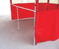
Sidewalls are not a necessity per se, but I believe that it really completes the booth and gives it that professional look. They also block the sun, wind and rain, keeping your booth somewhat protected from the elements though they can increase the temperature inside the booth a bit. We leave one of the back corners open a bit to facilitate air flow. Our sidewalls ($280) were purchased from California Palms along with our top. Though their sidewall prices seemed a bit higher than the competitions, I am quite satisfied with them. They are flame-retardant. Each panel zips to the neighboring panel, but there is also an additinal strip of fabric that velcros the two together, providing extra strength.
Most fairs, shows and events require that you have a canopy and many require that it be white, so be cautious of buying one in a different color. Many municipalities also require that it be fire retardant. A typical booth space at an event is 10ft x 10ft so I recommend sticking to that standard size.

Tables & Chairs - We spent a surprising amount of time looking at various tables and sizes. Do we go with two 8 ft tables and one 6 ft, four 6 ft, etc. We wanted to have some freedom to mix and match so we could change our set-up as needed and neither of those options seemed great. Also, most tables were 30 inches wide, much wider than I thought we needed. Having one such table on each wall would mean that our "floor" space would be greatly reduced, making the booth feel smaller than it is without really giving more display room. Eventually, we found some great folding tables ($30) at Target and Walmart. They were 48" x 20", so they could be re-arranged however we wanted. They were narrow enough that they didn't take up too much floor space. They are light and fold down quite thin, yet are strong enough for what we are using them for. We even found a matching smaller folding table for my wife to place her easel and art supplies on for the shows. For table cloths, we went to the local fabric store and browsed their remnant and clearance racks. We found a wonderful blue fabric that my wife then made the tablecloths with. They look great and bring a bit of class to the set-up.
Chairs were easier to chose of course. We bought two folding chairs ($60) and a folding stool ($20). My wife usually works on the stool at her little painting table while the chairs are used for myself and anyone who stops by for an "on-the-spot" painting.
Print Racks - We needed a way to display our prints so we began searching the popular art catalogs. I was astounded by the costs of print racks! To be such a simple piece of equipment, the cost was really high. So, being the cheap (wait, I mean "money-concious") person that I am, I decided to just make my own. I went to Lowes and purchased some 1" x 2" Redwood boards, some brass screws, brass chain, stuff to make the pivot point and stopped at Wal-Mart to buy some black canvas (should have gone with white). A few cuts and screws later and the frame was made. Genia was sick of sewing table cloths by that point, so I cut and made the canvas part myself and affixed it with brass screws. Easy job (about $20 each). We made that one large enough to hold our largest prints which are 24" x 30" matted.
For the smaller prints, I decided that an elegant display solution would be to use tempered-glass display cases. The glass panels are available for purchase individually so you can create whatever size you want. Here is a website that lists the available sizes and prices. Overall, they were cheap and easy and do a nice job and displaying everything up to 16" x 20" matted. ($15-$20 each).
Side-wall Display - Since we wanted to display framed originals and some of our larger prints on the walls of the booth, we had to come up with an easy way to "build a wall" to hang stuff on. While I was browsing through the Calfornia Palms website, I came across some frame-rails ($50 each, must request rail only). These are basically a "T"-rail that connects between two canopy legs. My first thought was that this could be a great way to provide some stability to the canopy to help deal with the heavy winds we get here, so I bought three. Then, I came across a product called grid panel ($11.50 each) which we could
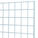
affix to the canopy and the frame-rails to give us our "wall" to hang pictures on. Grid panel, being steel wire, is quite heavy, so it was nice only having to buy 2' x 4' sections which sit on top of the frame-rail. We purchased 12 panels total, four for each wall. Lastly, we bought some grid-panel hooks that are great for hanging pictures from.
After a few uses, we found out that putting the grid-panels up and taking them down took longer than any other part of the booth set-up. So, I decided to simplify things a bit by using zip-ties to connect each set of two panels together. This meant only having to make six trips instead of twelve. I also bought a roll of Velcro One-Wrap to make some velcro fasteners for the grid-panel. I used two where the grid-panels connects to the top of the canopy, and three where it attaches to the frame-rails. Now, I can take the grid-panel off and leave the fastening system attached. Saves quite a bit of time and zip-ties.
Other Stuff - We decided that fine art greeting cards might be a good product to sell, so we purchased a 48 slot card rack ($49) from RobertHam.com. Its nice and light, assembles and disassembles very quick and does a nice job at displaying our cards.
We bought our picture frames (appx $250) from Aaron Bros, using their 40% off-coupon. Unfortuately, those coupons are only good for one item, per person, per day so we spent about three days going to all of the Aaron Bros in town to get the amount of frames that we needed (did I mention that I'm money-concious?). We still aren't sure we like the ones we bought however. They look pretty good, but the frames have a tendancy to scratch easily. Regardless of what you get, I recommend cutting some cardboard "spacers" to go in between frames when they are packed for storage or transport.
If you don't have a bag for your canopy, I highly recommend one. Our canopy bag ($50) is one of the rolling type, which I also highly recommend, especially if you followed my example and bought an expensive, professional canopy. It turns out that "expensive" is synonymous with "heavy" as our canopy weights in at over 75lbs. Wheels make transporting it much easier and it also protects the top from damage.
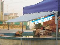
We purchased a canopy awning ($88) along with our the other items we got from California Palms. While it is not an essential item, we felt that it would entice more people to visit, or at least loiter in front of our booth by providing a bit of shade on those warm days. It does seem to work for that purpose and it also provides some extra sun protection for the artwork, especially since the print rack and card rack sit out from under the main canopy. With concerns of wind damage, I made some braces for the awning that should help to hold up to most of what we get up here.
Oh! Almost forgot the sand bags... If you will be showing in an area that occasionally gets even moderate wind, you'll definately want to invest in some good sand/weight bags for your canopy. There are a number of different styles out there. We opted to go, yet again, with California Palms. Their weight bags ($50 for 4) are made of heavy duty canvas with velcro on the sides to hold it to the canopy legs. What I like about them is that they already have the straps attached to fasten them to the top of the canopy frame. This means that you don't have to worry about bringing extra straps along and with these being nylon, they wont stretch and allow the canopy to move like bungie cords do.
Two more things that are helpful, though not essential, are some big storage boxes ($20 each) that we bought from Lowes and a hand truck ($100) we bought from Costco. The storage boxes provide an easy way to keep all of our prints, cases, accessories, etc together in one place, and makes for only two trips to the van instead of half a dozen, and the hand truck is great for those events where you can't drive up to your space to unload.
One last thing... The van. We have Subaru Outback that we used once to transport all of our stuff with. Granted, we had our son with us, but even without him, we would have had to strap stuff to the roof. As such, we've invested in a 1997 Chevy Astro Van. They are pretty reasonable to find used, have a great amount of cargo space (we leave the middle bench seat in and still have enough room) and drive pretty much like a car. We considered getting a full-size van, but my wife wouldn't have felt comfortable driving and parking something that large.
Art shows, fairs, swap-meets, exhibitions seem to be a part of life when it comes to starting out as a professional artist. While it can be boring and tedious, not to mention discouraging at times, you can improve your chances by having a professional looking booth set-up.
So, there it is, all (or most) of what you'll need to create a decent looking booth set-up.
Total Cost (minus the van) - appx $2,000
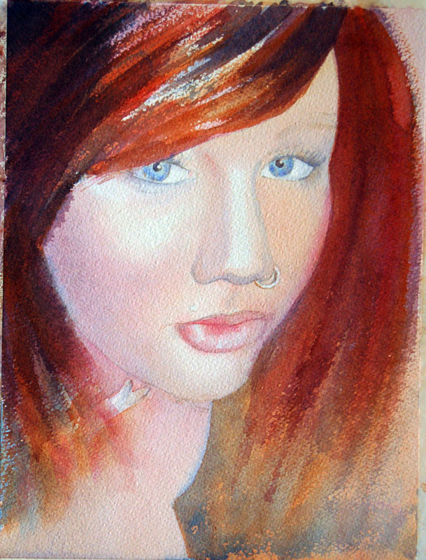
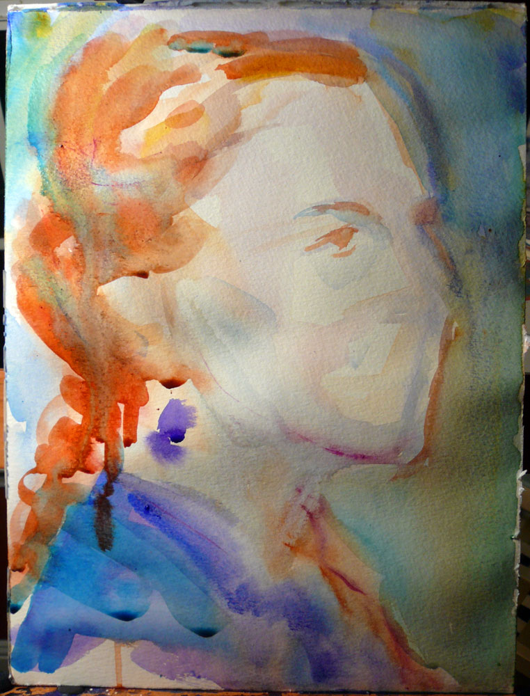
crystal
Crystal - step by step
in step by step
Here's the proof that I have not stopped painting nor forgotten my blog anniversary photo contest winners :) One of the paintings is now complete!
12 x 9" Watercolor on Lanaquarelle rough 140lb paper (actually, I forgot this was the rough paper, which isn't often used for portraits). As usual, I started with a sketch to decide on the composition and value - but I forgot to scan in the sketch : /.
Here, I already made the drawing and laid several layers down. Since this was a memorial portrait, I chose to stay away from the more expressive, impressionistic look that I've developed through A Portrait A Day.
crystal in progress 1
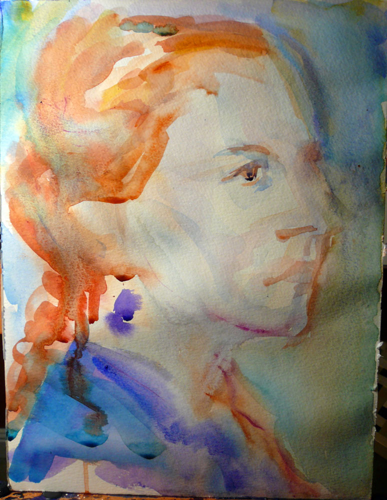
I continued to model the form and began adding her makeup. It was quite interesting to see how the painting suddenly started looking like the reference photo, just because I darkened the eyelashes.
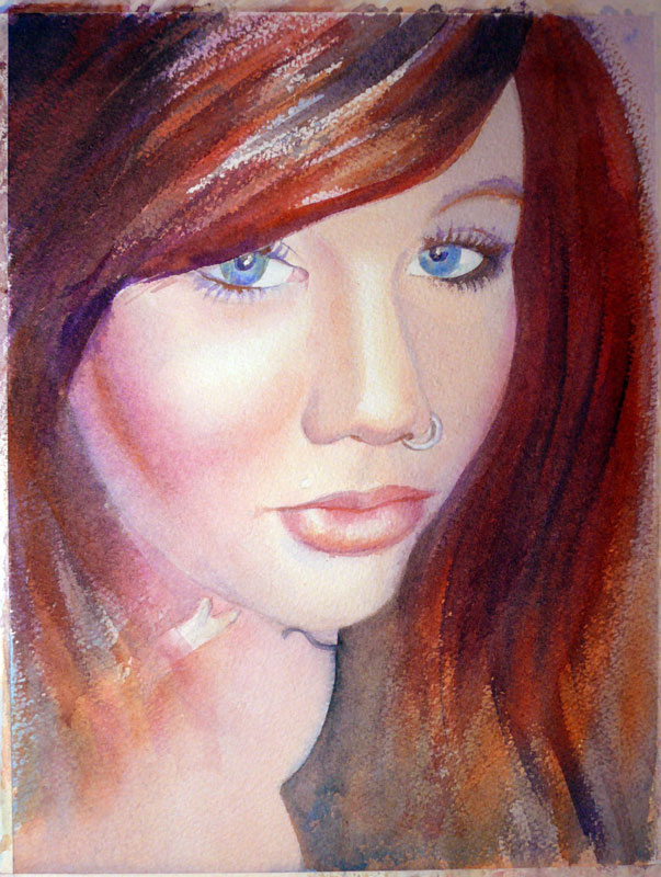
crystal ip 2
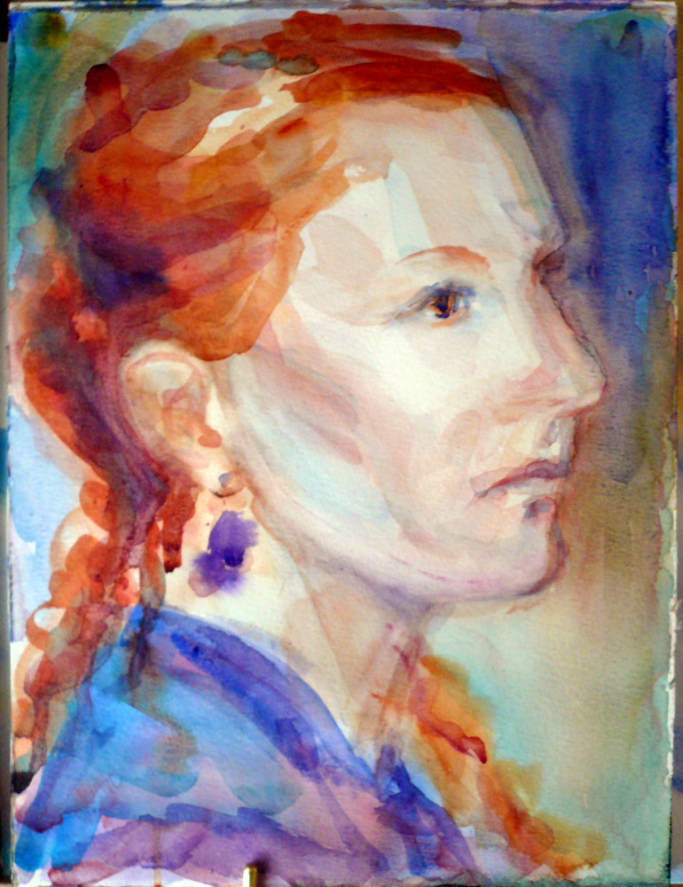
Lastly, I deepened the shadows, softened some edges, added more color throughout, and added blue to her clothes to echo the eyes a bit. I also got rid of most of the shadow on the side of her face (which was very dark in the reference photo but just didn't look right in a painting). I used a thin wash of acrylic gesso to cover the staining color I couldn't wash away. Scrubbing doesn't work very well on this paper, so it wasn't a real option.
crystal
The girl's parents were happy with the portrait...And I felt that it's the least I can offer to someone who's lost a child. I don't think I would be able to cope with something like that.
To learn about how you can order your own custom portrait, go here.
A Portrait A Day 58 - Tanya
 12x9" watercolor on Canson Montval CP 140lb. Reference photo - Tanya (neizmen) for JKPP
Nothing like the reference photo, but it was fun :)
Orchids in Red - watercolor on Yupo
in yupo
 5.5 x 11.5" Yupo, I've missed you. :)
Started off as purple-red orchids (which is what they actually are) on a light blue background - but I didn't like it and changed my mind to light flowers on a darker background. Thankfully, Yupo is perfect for changing everything in the middle of painting! I plan on making a similar painting with yellow orchids. My husband gave me the purple ones for Valentine's Day - and I'm proud to say they are still alive and thriving - and a couple of weeks ago, he brought me a pot with yellow ones. They also survived :)


okemo value sketch
Ink and watercolor winter landscape - step by step
This painting was a commission I did for someone who gave it as a thank you gift for a wonderful skiing vacation at the Okemo mountain in Vermont. As usual, I started with a sketch:
And, since the client wanted two skiers in the picture, a rough Photoshop mockup:
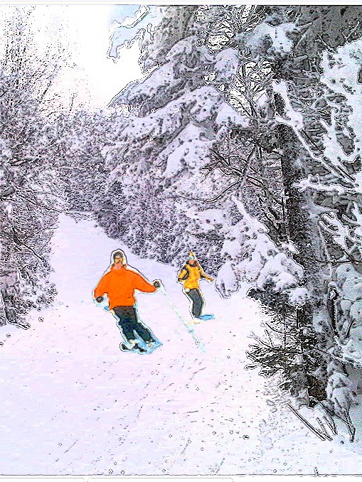
okemo mockup
On to the drawing and the first wet-into-wet wash (paper is stretched on an 11x14" stretcher frame and bordered with artist's tape to a 9x12" size):
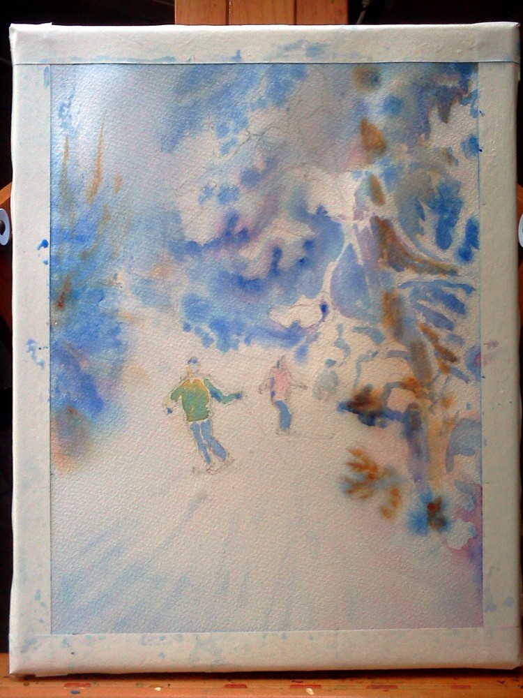
okemo ip 1
At which point I remembered that this was supposed to be an ink and watercolor painting...
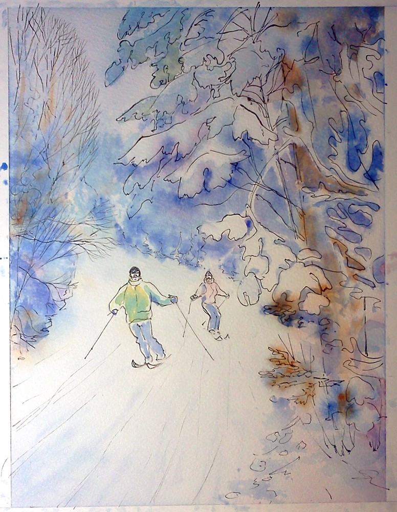
okemo ip 2
And after this, there was darkening of shadows and intensifying of color here and there. I also added some iridescent medium and snow, along with the writing on the bottom, to arrive at this:
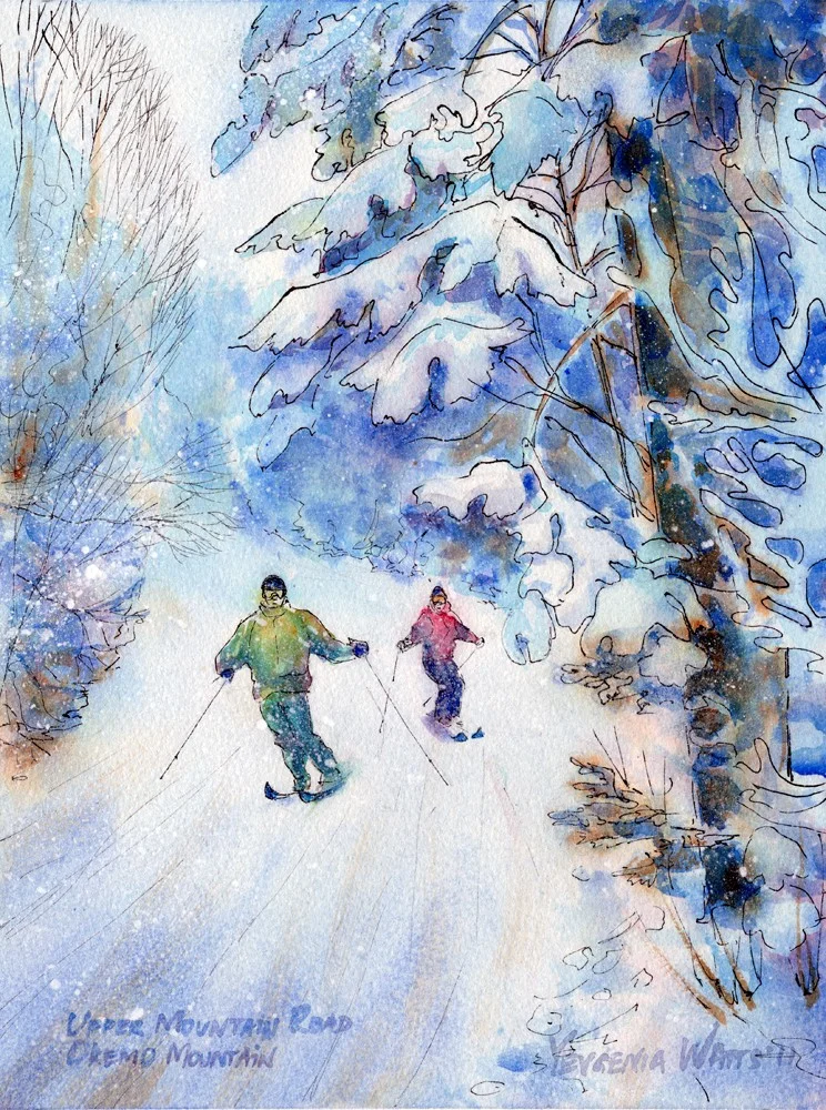
okemo completed
At the request of the client, I mailed the painting directly to the couple who generously let them stay at their house during the vacation at Okemo. I included one of my note cards that I think goes very well with this painting:

okemo with note card
nicole
A Portrait A Day 57 - Nicole - step by step
It's safe to say that it's no more a "portrait a day" - turns out I can't quite afford a reliable hour every day devoted to painting something for myself - but I'll keep counting them until I get to a stopping point (the current idea is to make it to September 2, a year after I started the project).
Meet Nicole from WetCanvas Portraiture forum
12x9" watercolor on Canson Montval 140lb CP. I really needed the excellent lifting ability of this paper here. It doesn't take layers or do granulation as well as other papers do, but lifting is so easy!
Ok, on to the step by step:
nicole wip 1
nicole wip 2
nicole ip 3
nicole ip 4
nicole portrait a day 57
I was temporarily commission-free for a day... Next week, I'm starting 5 11x14" street scenes for the Mississippi Blood Bank and, hopefully, a couple of paintings that I'm doing for free (including the Blirthday winners). Probably won't have time for the portrait-a-day : / But...I'm not really complaining :) I'm excited about the next week's paintings and I would like to get to a point where I have a reliable income from art. So...if you want me to paint something for you, drop me a line ;)
Mia - Baby Portrait Step by Step
I do not typically post the reference photos for the portraits I paint but this one is special:

reference photo mia
So you can see, this was more of a restoration project :) Starting with the sketch, to get familiar with the general shapes and try the values and colors that might work:
mia sketch
I also removed the baby seat and added the unicorn on the shirt - the unicorn has special meaning to the recipient of this painting.
On to drawing (my unfavorite stage, always takes tooooo long):

mia drawing
And the completed painting:
The curious thing about this painting is that the subject is the mom of another baby I painted :). Tried Lanaquarelle cold press 140lb on this. The paper is soft and has nice texture, glazes look beautiful on it. However, the paint sets in a bit too fast and lifting is very hard. I also encountered several light spots that would not take paint (almost like a resist).
To learn how to order your own custom portrait, go here.
A Portrait A Day 56 - Lisa
 12x16" watercolor on Arches CP 140lb. Reference photo - Lisa K from Julia Kay's Portrait Party. I started with a wash all over the sheet, worked with a palette knife, let it dry, finished with a large round brush. Oh, and some salt for the background, used at the end of the first wash. Relaxing...
Which is what I don't get much at all. Relaxing, that is. Grumble grumble.
Ok, a couple of news (sounds awkward...can you count news? It took me a while to get used to the idea that you can't count advice in English, you can only distribute it in pieces. In Russian and Ukrainian, you will get hundreds of advices, more than you need, really. You rarely get a piece of it. The Slavic soul is generous). So, the news. I joined an art society - Associated Artists of Inland Empire, which was the closest organization of this kind (only around 60 miles from here. Yes, I am being sarcastic). I am looking forward to getting a bit more involved, joining their plein airs, shows, and demos. Next month, Tom Fong will demonstrate his watercolor technique - and I hope I can find a babysitter!
Our first arts & crafts event this year will be next Saturday, March 19, at the Harvey House in Barstow. We are also participating in the Oceanside Days of Art (April 16-17, Oceanside, CA). Oh, the smell of the ocean again! :)
And the last news is that my husband is completely absorbed in his new hobby - stained glass. I think it is fantastic and I hope he sticks to it. Head over to his blog and see some awesomeness! I got some glass paint to try, well, painting on glass...
Virtual Paintout - Romania
 6x6" Ink/watercolor on Ampersand Aquabord. Location is in the city of Bucharest, Romania. Check out the other entries at the Virtual Paintout Blog! They're getting better every month.
Romania shares a border with Ukraine, where I am originally from. Virtually "walking" the streets of this beautiful city made me a bit homesick - which, I must admit, I have been for a while now... I know there isn't much point to it, the country where I grew up is not the same it was seven years ago, the people have changed, grown older, and we don't even talk anymore - and yet I can't help it. Something will always pull me towards that place on the other side of the world.
A Portrait A Day 55 - Elijah - my first pastel portrait
 5x7" Nupastel on Ampersand Pastelbord. Reference photo by the awesome Jordan Boesch and this embodiment of intense focus is my son Eliajh :)
Ooh...it HAS been a while! Various important and just unavoidable things kept me from painting (not counting commissions) for a couple of weeks :( I am looking forward to getting back into daily (or almost daily) painting.
I parted with two of my recent "moody" miniature landscapes but I was glad to send them to someone I got to know through a commission (step-by-step coming soon).
As for today's portrait, I have been interested in pastels for a while now and have tried some here and there, with varying levels of failure. I have never tried working on a sanded surface until a couple of weeks ago, when I did a figure study of my husband on a sanded Colourfix paper. What a difference! Like with watercolor, the surface your work on can have a tremendous impact on the outcome of your work in pastel (unless you're a pastel genius and can work on anything?)
I know I have a lot to learn when it comes to pastels, but I like the process!
A Portrait A Day 54 - Carly
 12x9" Watercolor on Canson Montval CP 140lb paper. Carly is a member of Julia Kay's Portrait Party, see her thread here.
Needed something relatively easy to paint, hence this frontal view of a pretty girl face (it's hard to mess those up :) ). I do like that shadow on her face and the way she is emerging from the dark background.
Results of the blirthday contest!
According to the best traditions of my college life, I am posting the results of my blirthday photo contest at the last moment. Thank you to all who participated! I enjoyed "meeting" and getting to know you a little better through your pictures and emails. I would love to give every one of you a free painting...But I won't :) The free painting goes to Elza Metzelaar and her dog Athena:

I love the warm, comfortable colors of this photo, the inviting background, the flower bandanna, and, of course, Athena's expression! Congratulations!
And this could be all except that I was having such a hard time picking one photo, I had to at least do a 2nd and 3d place. So, please cheer for the runners-up!!!

2nd place goes to Katie and her "grand-darling" :) I love the pose and, paradoxically, the lighting. I am going to make a portrait-a-day painting based on this photo and offer Katie a discounted price on the painting and prints made from it. Katie is a talented photographer and actually has a very nice collection of photos on Flickr, each of which would make a good painting.

3d place! I promise I am not biased, but this is also Elza Metzelaar :). Needless to say, I could not resist the juicy colors and I will be painting this on Yupo. Elza will have an opportunity to order discounted prints (if, of course, it turns out well!).

And, finally, there's Crystal. Remember me asking for the stories behind the pictures? It is a sad story and really, something more like a community service award...It goes to A.J. Foran, Crystal's mom.
Crystal died in a car accident in 2007 at the age of 19, here in Helendale, California. Since the death of her daughter, A.J. has turned her grief into giving. She has held a toy drive every year since, donating the toys to the California Highway Patrol. She works tirelessly, sitting out in freezing weather to get donations. This year, she raised over $3,000! The CHP said that she provided 25% of the toys given out to kids in the entire high desert by the CHP! She does this in memory of her daughter.
I would like to give A.J. a painting of Crystal. A very small token of my sympathy, respect and appreciation that is shared by many Silver Lakes residents.
And please, PLEASE buckle up!
A Portrait A Day 53 - Karen (WIP)
 12x9" watercolor. Not quite happy with it yet, hence a WIP. Comments and critique welcome!
Oh, and don't forget that TOMORROW I WILL PICK THE WINNER OF MY BLOG ANNIVERSARY COMPETITION!!! You still have a little bit of time left to submit your photo for a chance to turn it into a painting.
Chris and Sarah's Adoption Journey
in announcements, yupo
Last week, I received an email through Etsy asking me to donate some art for a silent auction intended to raise funds for an adoption. I didn't think much of it at first but I went to their blog and read the story behind this request. This Louisiana couple has been trying to have a baby for 7 years and finally, decided to adopt. They are currently in the middle of the process, with the baby due on April 15. So, after exchanging a couple of emails with the future-adoptive-mom's sister (who contacted me in the first place), I decided to help out. I have a 1.5-year-old son who, while making me fear for my own sanity at times (yep, already!) and taking way much more time and attention than I bargained for, is the joy of my life. I am sure that all of the above will become true for this brave couple :)
The auction will be held tonight starting at midnight through Sunday midnight at http://thescottsblog.wordpress.com/. In addition to a number of fantastic things donated by artsy and crafty people from all over U.S., you will have an opportunity to bid on these three archival prints:

"Cherry Blossom II"

"Poppy Field"

"Brooke VI"
Hoping to send these to some familiar names!
A Portrait (or figure) A Day 51 and 52
These are from the life drawing session last week, and I'm going to go ahead and claim them as portraits-a-day :P. Both are definitely well under an hour total.

15x11 Watercolor on Kilimanjaro CP 140lb. This is Rachel, who is a talented artist herself and is now getting into art modeling. Last Thursday was her first time modeling and she was just fabulous. She is getting this painting as a gift from me, the happy figure-painting addict :) I would also love to work with her more, maybe do a real full-sheet reclining nude...Or a mysterious backlit sitting pose...

15x11" Watercolor on Kilimanjaro CP 140lb. Aaron (or at least, that's what I think his name is) is a model with some experience. He poses for a local college. If you are having difficulties understanding what is going on in this picture, I do not blame you. He was crouching on top of a cube, with his long-haired head hanging low and his hands trying to hold on to the cube. Pretty neat, actually, and I wish I had more time to work on this pose.
I will post more sketches and paintings from this batch when I find the time to scan and photograph them. Hopefully, soon. I'm experiencing a bit of a burnout lately...Which is probably due to the increasing volume of commissions (not that I'm complaining!) and decreasing duration of my son's daytime nap. I really need to go do something fun, like a concert or art walk or jumping off a bridge strapped to a bungee cord.