Another sunflower for today! This time, I put the color down wet-into-wet and pushed it around with a palette (or, rather, painting) knife to create the petals. This is one of the most recent paintings done as a demo for my adult watercolor painting students. I also started teaching middle/high school age kids. Still trying to figure out how much I like doing it. On one hand, the kids need much less directing and teaching than adults do - they generally have more confidence in their artistic abilities - on the other hand, they are often less motivated and definitely less serious about this whole traditional art business...
collen
Colleen - Portrait of Little Girl with Pumpkin Step by Step
First of all, let me say that I was immediately inspired to paint this portrait when I saw the reference photo. I love the backlit figure against the pumpkin patch background, the abundance of rich colors and, of course, the priceless expression on the little girl's face. I knew it was going to be a good painting right away.
I started with a thumbnail sketch, with a bit of color to help me plan the painting and communicate to the client what I see when I look at their photo:
collen sketch
After the sketch, I stretched my paper and made the drawing using the grid method.
colleen step 1
A word about using the grid method with portraits: after you find your reference points and locate the facial features, make sure you double-check your drawing with the usual facial proportions rules. I.e, the vertical center line hits the features in the middle, the horizontal lines of the eyes, bottom of the nose, and mouth are parallel, the distance between the eyes is approximately the width of one eye, the lines from the wings of the nose to the inside corners of the eyes are parallel, etc.
colleen face
Next step: wet-into-wet background wash and ultramarine blue in the shadow areas. I also put light yellow, red, and orange washes over the skin areas.
collen in progress 2
Next, I continue working on the hair and face, put a wash over the shadow side of the pumpkin and reclaim the round shape of the pumpkin on the right using a scrubber brush.
colleen ip 3
Next, more work on the pumpkin and main shapes of the face. i also deepen the skin tones using transparent quinacridone red and quinacridone burnt sienna.
colleen in progress 4
Next step. I might be guilty in spending too much time an effort on the hair, but I just can't help it. I like painting hair. I darken the shadows throughout the painting, define the eyes, soften the hard edges around the hand and add detail to fingers and the girl's dress. Almost done.
colleen in progress 5
From the last stage to the completed painting, it's just a matter of deepening the shadows even more and refining the important details. I also add a few spots of semi-opaque yellow to the pumpkin and, in a more transparent manner, the girl's face. These last steps seem fairly insignificant, and you may say that the main idea of the painting was already stated in the previous stage - but they often take the longest time with a lot of reflection and evaluation. When my additions and refinements are no longer making the painting better, I declare it finished.
colleen
I find it important to take it slowly at the end, so that I have a lot of opportunities to step away from the painting and come back to it with a fresh eye. It helps me catch myself before I overwork it - although, of course, the level of finish is very subjective. Some other artist would have stopped twenty hours ago, while another one might want to work it to a more realistic stage.
Burning House Art Studio Watercolor Workshop
Recently, Burning House Art Studio hosted my Intro to Watercolor course. It is a beautiful space and I really enjoyed having the class there. Definitely my favorite venue so far! The workshop was a bit short on students - but what they lacked in quantity, they made up for in quality :)
My typical first class homework assignment is this: paint an apple twice. Once, wet on dry, second time, wet-into-wet. I am lucky if I get two paintings out of each students for the critique at the beginning of the next class. This time, one of my students brought 13 paintings of apples. That's right, all of those apples below are by the same student. Talk about taking your art seriously! (I got about 20 more next time around :))
Another student has not picked up the brush since she was a kid. I usually let my students paint without help first, so that I can get a feeling for the level they are at and what they will need help with. Below, is her painting with and without my help.
I like quick, timed paintings. The idea is to set the timer for, say, 10 minutes, and go at it without too much thinking. Just let it happen. When the time is up, you put down your weapons and step away from the painting. This accomplishes several things:
- You can't help but loosen up, even if just a little bit
- You push through your initial hesitation and fear
- You only have to stick with it until the time is up - if it's a total failure of a painting, oh well! You only spent 10 minutes of your life on it. No big deal.
- Once in a while, you get gems! Loose, free, colorful - just like you like it!
Below are some examples of pretty awesome 10-minute paintings. Try it!
If you live in the high desert, come take a workshop at the Burning House Art Studio. My next class will be Intermediate Watercolor and will meet on Wednesdays, 10am- 1pm, starting on August 1. Hope to see you there!
Rainy Night in New Orleans Watercolor Painting
After a failed first painting and all those studies, this is where it took me. I am pretty happy with the end result, and so is my client :). A couple of lessons learned:
- When venturing out to paint an unfamiliar subject (and I've never been to New Orleans, as of today, or painted rainy nights. I have painted IN THE RAIN though) - when painting something new, it is a very good idea to do some studies. Duh! :)
- When stuck, ask for advice. Also obvious, but I'm one of those people who'd rather get lost than ask for directions. I reached out to people in the EDM group and my fan page on Facebook, and the feedback was extremely helpful.
- In addition to getting myself more familiar with the subject, the studies allowed me to try out color schemes and moods and kind of search my heart to figure out what I wanted out of this painting. I think the end result is fairly close to my initial vision.
- I need to paint more (and I could put the period here) scapes. Streetscapes, landscapes, cityscapes, seascapes. For a while now, I've had the idea of a painting project in my mind, something focused on landscapes. Maybe 30 days of landscapes. Or a landscape a week...if only I could rely on my kids to sleep simultaneously (which they never do, except at night).
In case you are wondering why I didn't sign this painting, I was asked not to do it on the front. The painting will be a part of a wall collage along with other artworks, illustrating events from the client's life. I guess the signature would be distracting or something...I'm very curious to see it when it's done.
So, what do you think about it?
Painting in progress - how to get unstuck?
This rainy night in New Orleans painting is one of the commissions I'm currently working on. After several sketches in grayscale and color, I moved on to the 11x14" painting. The first couple of washes looked fine but as I kept working on it, I lost the vibrance and spontaneity that I really want this painting to have (an easy thing to lose in watercolor!). I took the masking off too early and ended up with too few whites to work with. I also didn't like the way that the colors in my painting interacted, I felt it was a little too dissonant. So I abandoned the original painting and started making studies. Different color schemes, different ways to leave out the whites, more or less wet-into-wet-ness - but overall, trying to keep it fresh (as a rainy night should be). This also coincided with me finding a pretty good blog post by David Kessler with tips on how to loosen up your watercolor painting. Most of those are things that I keep telling my students but it's one thing to know it and another, to remember to apply it when you're stuck and don't know what to do. Kessler's post was definitely helpful.
I now have four studies, in addition to the original painting (the one on the very bottom). I would looove some feedback! Which version do you like best? What works (or doesn't work) for you?
Happy 4th of July!
To all Americans, Happy Independence Day! I should say something like "fellow Americans" - since technically, I'm a citizen and all, but it still feels awkward...I guess it's kind of like getting married - your in-laws are your family now but it's not the same thing as the family you grew up in.
Anyway, happy 4th of July to you, and I hope you are having a great day spending it the way you like! I, personally, am hoping for an hour when both of my kids are asleep and I can paint :).
The image above is part of a custom architectural painting I did last year. My favorite part of that painting, actually.
Blick's Featured Artist of the month is yours truly
I'm posting this a bit late, but I still wanted to share the good news: I was selected Blick's Featured Artist of the Month for the month of June. The award comes with a nice $75 Blick gift card (which, to be honest, was my primary motivation for sending in my submission). After a lot of painful indecision, I spent the gift card on these:
They came in today and I can't wait to draw them! Here is the link to Blick's product page for these hand models:
If you are interested in submitting your art for the Featured Artist of the Month, check out this Facebook page.
More Sunflowers? Why, yes!
There is something about compositions with two objects that intrigues me. I'm sure at some point in my art or design education, I was taught to not put two of the same thing together - something about symmetry and boredom and lack of focus. And yet I keep painting these pairs. Maybe I like the challenge of breaking a rule and attempting to make it not boring. Maybe having two objects gives the image a kind of a tension, charge, energy, as the shapes pull in different directions and vie for attention. What do you think?
Yellow Apple Wet-Into-Wet
Just a little demo I did for my watercolor class. About 7.5 x 5.5". More pictures of the class itself and the wonderful studio space that I am thrilled to have my workshops in, will follow :)
Child on the beach watercolor step-by-step
When I was a kid, my family used to go to interesting places like beaches and river banks and forests a lot. I guess it was easier with one or two children than later with three or four (I have three younger brothers). The coast of the Black sea was a mandatory annual pilgrimage. I was sick a lot and the sea air, salty water, and the sun was supposed to help with the constantly stuffy nose, sore throat, and any other ailment. I don't remember if they did, but the summer days spent near the sea were some of the happiest days of my childhood.
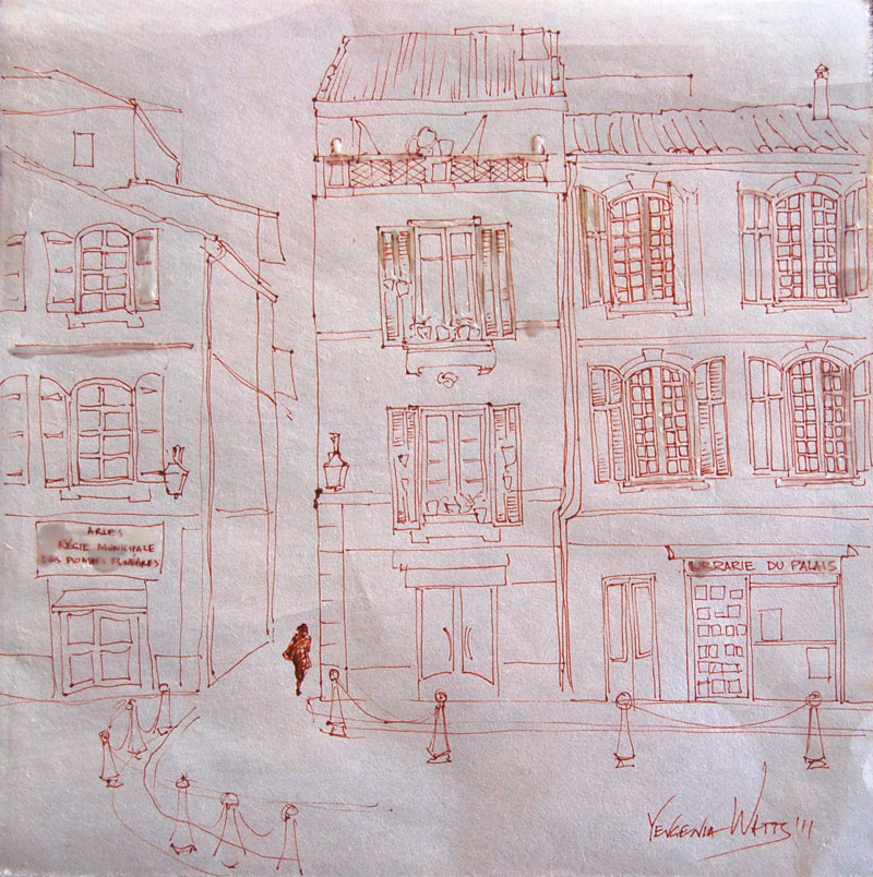
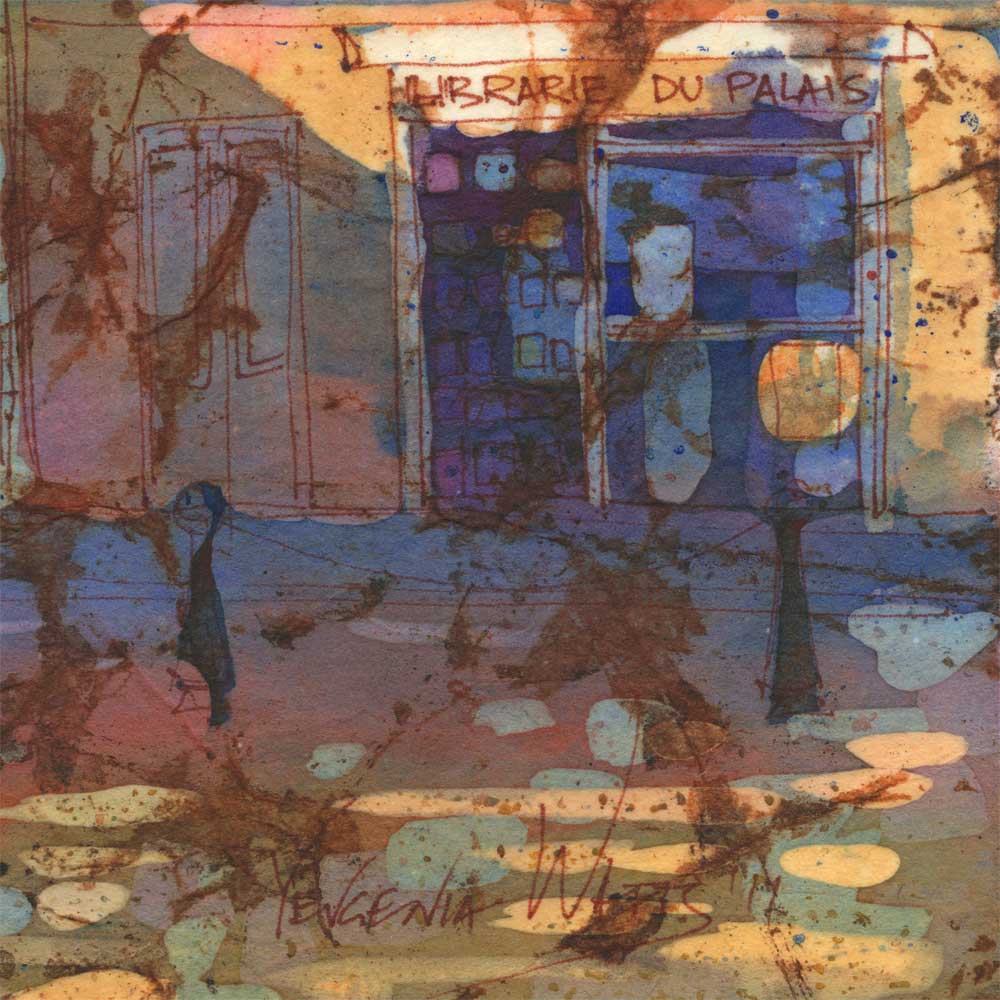
This painting reminds me a lot about those days. Lazy picnics with watermelons and cherries, seashells and colorful stones which gave me a wonderful sense of discovery, every single one of them. "Kazinaki" - sweets made out of shelled sunflower seeds and caramelized sugar. Street artists.
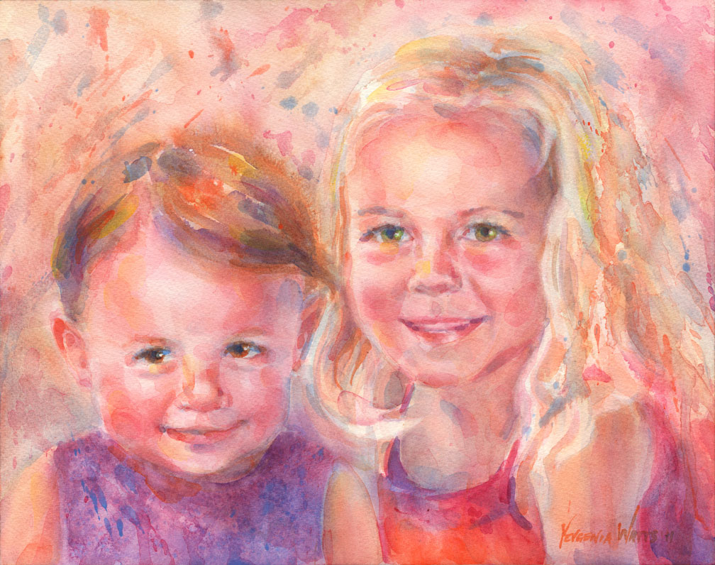
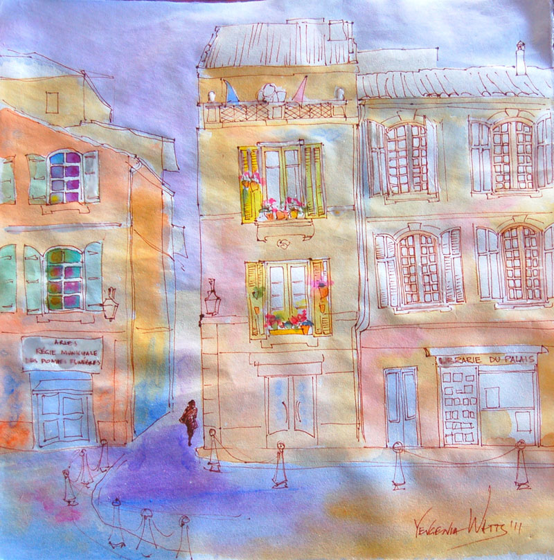
The girl in the painting lives in Canada and is graduating from medical school this year. The painting is a graduation present for her parents (what an idea!). As usual, I started with a sketch to get familiar with the subject, think through the composition, color, and hopefully, detect any possible issues. I recommended zooming in on the girl but the setting in this case is very important to the clients, the special place they went on a vacation to.
Next step is the drawing. I used the grid method.
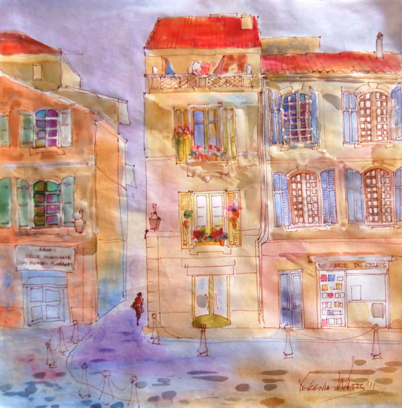
On to the first washes:
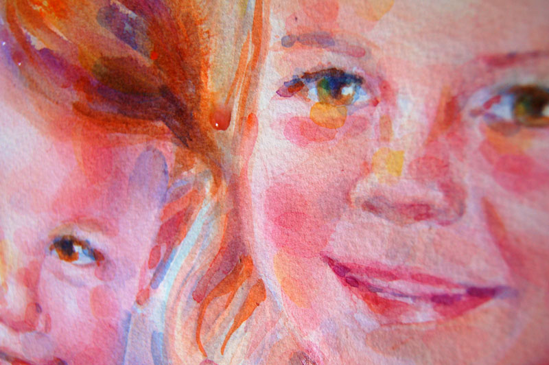
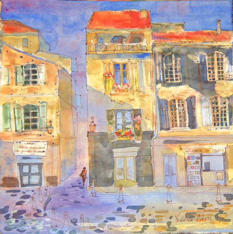
The left eye didn't quite work out at first, so I wash it off. Making the background deeper and filling in the skin:
Fixed the eye. Even darker background, which turned out to be a bit of an overkill...:
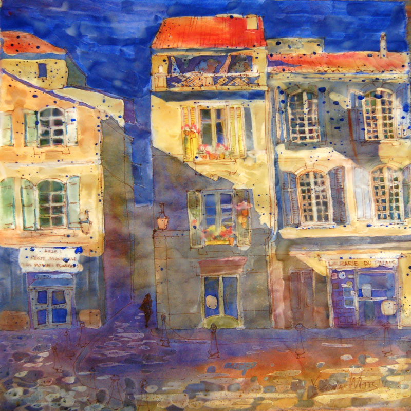
Lifted off some of the background, more detail throughout, especially on the figure and foreground:
And the finished painting:
Interested in a painting based on your own favorite memories? More information here.
Painting classes start in a week!
June 2, to be precise. I can't wait! And not only because it's a welcome break from full-time, nay, overtime mommying. I love sharing what I learned through the years of art-making, even though I feel that I only barely touched the surface of what there is to be learned. My classes are expanding. In addition to both basic and intermediate levels at the Apple Valley Town hall, I am starting Intro to Watercolor at Burning House Art Studio on June 11 and another beginner class in Helendale, where I live (June 19). I'm also developing a couple of courses for middle/high school age kids and contemplating a portrait workshop some time in fall. Obviously, having a baby hasn't slowed me down enough :)
Not that I don't want occasionally to throw in the towel. Finding time for anything is even harder now...But for the sake of everyone involved, I have to paint. The darkest times in my life were marked by NOT painting, and getting back to making art (often, taking a class) usually pulled me out into the daylight.
Anyway, here are some more paintings from my intermediate class (the students would protest that none of theirs is finished, but oh well :)) :
Happy Mother's Day!
Meet Baby Katia!
Here she is, my excuse for being so out of everything for almost half a year. She was born on April 3d, weighing 8lb 3.9oz and 20 inches tall.
She's a healthy and mostly well-behaved baby (minus last week, when my mother-in-law was visiting. Looks like my kids just automatically become hyper when grandparents are around!) My son had a pretty tough time the first two weeks but seems to be recovering from the shock. He likes to hug and kiss the baby and always runs to the rescue when she's crying :) (he even says, "Al rescate!" - Spanish for "to the rescue!" when he does that).
I'm somewhat overwhelmed and trying to keep things low key and slow for now. I would love to have a couple of weeks of just me and the baby. Nevertheless, things are picking up speed...I've had several commission inquiries, some Etsy sales, and I'm getting ready to teach more classes in the summer.
Two Quarters
For more information about prints, please visit our product info page.
Green Pear
For additional information, please visit our product info page.
Blue Pot with Hydrangeas
For more information about prints, please visit our product info page.
Read about this painting (including a step-by-step demo) on my blog.
Adelaide and Gianna - double portrait
Here is another one of my Christmas commissions, two beautiful little girls who are cousins and live on the opposite sides of the U.S. I painted this in record time - less than a week. As it often happens with my group portraits, it is a composite of several reference images. I enjoyed working in a looser, more "impressionistic" manner, which is also part of the reason why I could finish the portrait in such a short time. The multiple-glaze smooth and "realistic" look requires that the bottom layer is bone dry before applying the next one.
If you are interested in a custom portrait, go here.
My new website design is up and running (thanks to my wonderful husband :)) but will probably be a work in progress for some time. I still need to find a good way for people to shop my greeting/note cards and some logical place to put my artwork that is not for sale (like the sketchbook section). Any ideas? What do you think about my website in general?
Sketch of a Clock
New Web Design Coming!
Just an announcement - I will be changing the look of my website over the next week or so. Please do not be alarmed if it looks horrible :P Please bear with me as I make these changes. Thanks!
Wedding portrait in watercolor
Wedding portraits? Yes, I can say now I've done that, too :). And with the Valentine's day impending and all, I thought I'd share a recent wedding portrait I did for a wonderful new collector. This is one of my smallest portraits ever (rivaled only by the Icelandic Lady) and it gave me the opportunity to work with some brushes I normally never use - like #3 and 4 red sables. It also involved quite a bit of imagination, since this couple did not have high quality wedding photos, and development of a few ideas before we settled on this version.
Interested in having your own wedding or anniversary portrait? Here is how it works.
How to Make Watercolor Batik on Rice Paper Step-by-Step Demo
Watercolor batik is a painting technique that has been floating around for a while. I have painted on fabric before (not batik method strictly speaking), I knew the theory (basically, you use wax/paraffin in place of masking liquid and rice paper in place of regular watercolor paper) and I kept seeing paintings done in this technique here and there. Finally, months after bookmarking a demo by Kathie George on Artists Network, I decided to give it a try.
Materials and gear:
- Watercolor paints
- Some kind of oriental/rice paper. I used something looking like the regular sumi-e rice paper (the one that has no sizing and makes your paint run like crazy)
- Ink pen (optional). I used Pigma Micron
- Brushes - your regular watercolor brushes plus something designated specifically for applying paraffin. I used a 1.5" flat bristle brush from a hardware supply store and a couple of smaller bristle brushes.
- Electric griddle or some other way to keep the paraffin melted.
- Paraffin - I used a candle stump
- Iron
- Lots of newspapers/tissue paper/any thin absorbent paper that you can use for ironing the paraffin off your painting
The process
1. Make your drawing if you plan on having the lines. If you need to make a sketch first and then trace it onto the rice paper, be my guest. I drew straight on the rice paper - I think the uneven lines are not so horrible and actually add character.
Here, I already decided what my lightest lights are (a term meaning the areas of the artwork that will be the lightest in value. In watercolor, you typically leave them untouched, no paint at all). I masked them out with melted paraffin.
2. Apply first wash of color. You will be working from light to dark, so decide what your next lightest areas are and fill them in. Often, those are going to be your yellows, as they tend to be light in value. I also painted the bright colors of the flowers on the windowsills at this stage. I wanted to keep them fresh, so no more layers of paint on top.
3. Apply more paraffin to areas that you want to keep the way they are. Paint middle values.
4. Same thing. Mask out the areas that you are happy with and move on with another layer of watercolor. Here I am about to add the darks.
5. The image below is almost completely covered with paraffin.
6. More paraffin, more paint.
7. Once you're done, cover it all completely with paraffin and crinkle the paper. Apply a wash of color on top. I chose rusty orange to match the color of my ink lines. It will bleed into the cracks and bead on top of paraffin.
This step is optional. If you don't want the web pattern on top of the painting, feel free to skip it.
8. Newspapers and iron time. Place the painting between several layers of newspaper or tissue paper and keep ironing until all of the paraffin comes off. You will need to change the layers of paper to new ones in the process.
This is what it looked like after removing paraffin. I was fine with it for a day but then decided the white spots in the bottom third of the painting were just too distracting. When I tried painting them over, I couldn't: there was still some paraffin in the paper. One extra ironing removed it and I was able to tone the white spots down.
Here is the finished version:
Detail views:
And a handy time lapse video: French Windows
Hope you enjoyed it! Questions? Suggestions? Comments?