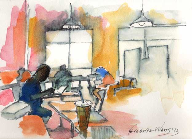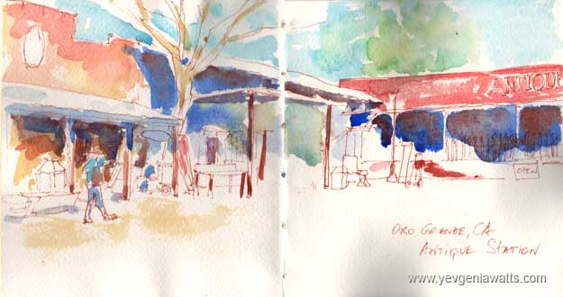
I recently created a Facebook group to help local artists to organize meetups and get together (High Desert Art Meetup). On Saturday, we had our first sketch-out! I chose the location on Route 66, around the local antique shops. The place turned out to be a gold mine of things to sketch! Everyone enjoyed the outing.
I was pleasantly surprised when five people (not counting me) showed up. When I moved to the high desert three years ago, I was quite disappointed with the apparent lack of culture or any interest in art here. Since then, I have discovered a small community of people who share my passion. Some of the discoveries came though the Eclipse Art Gallery (which I watched develop and grow by leaps since it opened in 2010). Some people found me through the classes I teach in Apple Valley and now, Helendale.
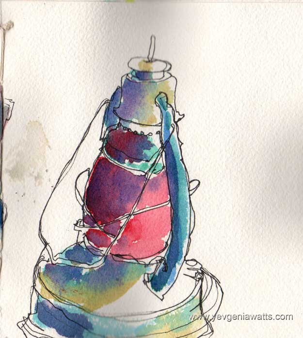
I got to use my brand new handmade (by me!) watercolor sketchbook. It was fairly easy to make and performed beautifully. I might write another post just about the making of the sketchbook - meanwhile, help yourself to this video on coptic stitch that I learned from.
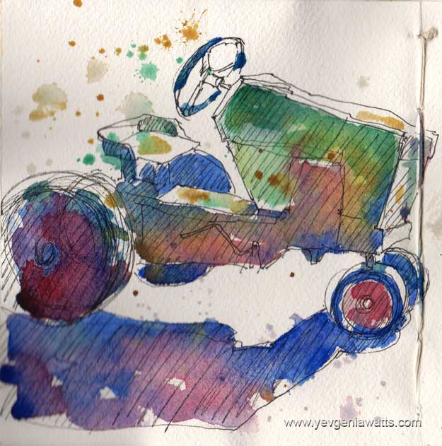
We spent about two hours walking around the place and sketching. Some people took photos. The weather was pretty close to perfect, and after the sketching session, we went to a nearby pizza restaurant for lunch. I was hoping to sketch the outside view of the restaurant itself (it has a colorful uhm...statue of a cow on its roof) but ran out of time while trying to take in as much of the antiques place as possible.
Overall, the sketch-out was a success! I'm happy that I went ahead and organized it and I was glad to spend some time doing what I love with (or, rather, in proximity of :)) people who share my passion for art. I hope we will do it again soon!